
Late afternoon in Santa Fe can make a wall look finished before a single nail goes in. The light comes in low and clean, catching the grain of plaster, the weave of a textile, the slight sheen on a varnished surface. A large work that felt generous in the gallery can suddenly read as overconfident in a smaller room; a quieter piece can turn magnetic once it sits against an adobe-toned field and has room to breathe. In that kind of light, scale is not an abstract number on a label. It is how the work meets the room, how the frame clears a doorway, how the surface holds up when the sun shifts across it.
That is why choosing art that lasts is less about a single strong reaction and more about a chain of judgments: provenance, condition, medium, scale, placement, authenticity, and fit. A painting with a beautiful image can still fail if the support is unstable, the restoration is poorly documented, or the dimensions are off by a few crucial inches. In a market shaped by serious collectors, working artists, and long memory, the useful questions are concrete: Who handled it before? What has been repaired? Is the medium suited to the light and humidity where it will live? Will the work still feel resolved when it leaves the gallery and enters your home?
As the earlier notes suggest, the best purchases usually come from slowing the decision down just enough to compare what is seen with what can be verified.
Table of Contents
- Evidence and paper trail: what to verify first
- Condition, medium, and conservation implications
- Scale, placement, and how the work lives in the room
- A 90-second checklist before you buy
- Authenticity, comparison, and when the story outruns the object
- How to use Santa Fe as context without outsourcing your judgment
Evidence and paper trail: what to verify first
The first thing to ask for is the paper trail that supports the story: invoice, certificate of authenticity, gallery receipt, exhibition history, and any conservation note that explains repairs or relining. A clean narrative without documents is only a narrative. If the seller cannot show who acquired the work, when it changed hands, and on what basis it is being attributed, the price should drop, or the conversation should stop.
That becomes especially important when a work is being presented with the authority of a regional market such as Santa Fe, where strong reputations can travel faster than documentation. A buyer can test the offer with one direct question: “What document most strongly supports the attribution, and who issued it?” If the answer is vague, or if the chain of ownership has gaps that cannot be explained, the risk moves from aesthetic to financial. For a useful comparison, ask for a second work of similar medium and scale from the same seller; thin provenance often shows up as inconsistent pricing, uneven labeling, or a story that changes when the details are checked.
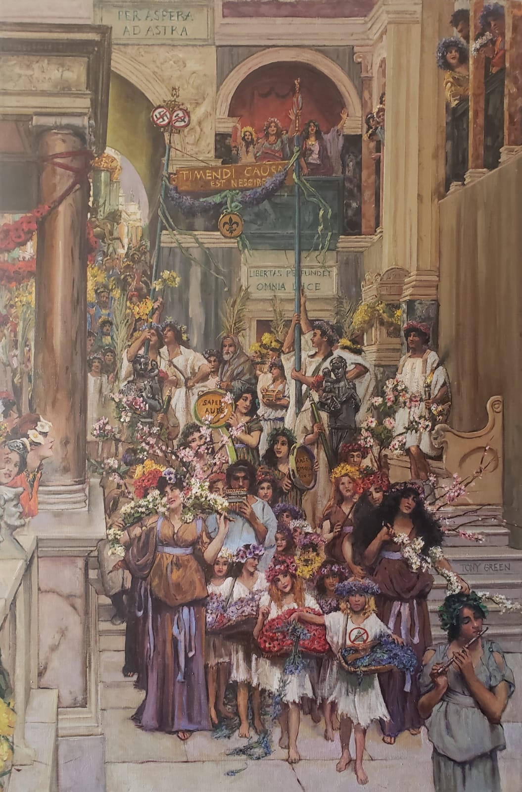
Measurements should match the documents exactly, down to the support and framed size if framing is part of the sale. A painting listed as oil on panel should not quietly become oil on board, and a work described as 24 x 18 inches should not be presented in a frame that makes the visible image materially smaller without disclosure. If the seller has a clean set of records, they will usually answer plainly and without defensiveness. If you want background on the artist’s practice before comparing available work, Tony Green’s About page is the place to start, and current examples in the Shop help you compare medium and scale against the paperwork.
When the proof is credible, the next question is not romance but fit: whether the condition, medium, and recorded history can sustain the value being claimed. If the file is thin, that decision is already partly made for you, and the safer move is to ask for more documentation—or, for a room-specific commission, to speak through the details on the Commission page before anything changes hands.
Condition, medium, and conservation implications
The file may be persuasive, but the object has to survive the room. In Santa Fe, where light is strong and walls often carry generous scale, the practical question is how the work will age once it leaves the studio or storage rack. A painting in oil on linen with a stable ground, for example, can handle different display conditions than a fragile mixed-media surface with lifting pigment, and that difference should be visible before money changes hands. Ask for the support, the medium, the dimensions, and the date of any restoration work in the same breath; if the seller cannot answer cleanly, the condition story is incomplete.
Small defects are not always dealbreakers, but they change the math. A minor abrasion at the edge of a canvas may be acceptable if the frame covers it and the stretch is sound; a network of cracks near the image field, or varnish that has yellowed unevenly, can affect both appearance and future conservation costs. The useful question is specific: “Has the surface been cleaned, relined, revarnished, or retouched, and if so, by whom?” If the answer references prior ownership history as well, that is a useful cross-check, not a substitute for the condition report itself.
Material choice also affects placement. A work on paper will want glazing and controlled light; a heavily textured oil can tolerate more visual distance but may need a deeper frame or more forgiving sightline. If you are comparing a gallery piece with something by Tony Green, use the object in front of you as the standard: note the support, the scale, and whether the finish reads matte, satin, or glossy under indoor light. For buyers who want a room-specific solution rather than a compromise, the Commission page becomes relevant before the purchase is final, because the room can dictate the right size and surface treatment.
One practical comparison usually settles the issue: place the asking price beside the expected conservation burden. If the work needs custom UV glazing, a new frame, or specialist stabilization, those costs belong in the purchase decision, not afterward. That is where the earlier paperwork matters in one clause, because a clean record makes the condition assessment easier to trust. Once the material facts are clear, the next test is physical: whether the piece can live where you intend to hang it, with the right light, distance, and scale.
Scale, placement, and how the work lives in the room
The room test is where a promising piece becomes a serious purchase. A work can be beautiful in the gallery and still feel thin above a sofa, too commanding over a narrow console, or lost on a tall wall with too much breathing space. In Santa Fe homes, where adobe textures, deep window reveals, and shifting daylight can change the read of a painting by the hour, dimensions matter as much as image. Ask for the exact height and width of the image, then the framed size if framing is included; if the work is unframed, note the edge treatment and whether the surface is meant to be seen bare.
Measure the wall before you fall in love with the piece. A practical check is to compare the artwork’s width to the furniture below it: a common visual anchor is a work that spans roughly two-thirds to three-quarters of the furniture length, with enough margin so it does not feel crowded. If the seller offers a detail sheet, keep an eye on hanging weight, frame depth, and whether hardware is already installed. For work by Tony Green, that conversation is especially useful because classical methods often reward close viewing and controlled placement; his background and available work help you compare scale and surface before you commit.
Lighting can change the decision entirely. A painting with a varnished surface may catch window glare at certain hours, while a matte ground can disappear under dim track lighting if the wall color is also dark. Before buying, ask where the work has been photographed and whether the image was taken in natural or artificial light; then compare that to the room where it will live. If the piece is meant for a stair landing, a hallway, or a room with one strong window, think about the viewing angle as well as the front-on view. A composition that reads clearly from six or eight feet away may be exactly right for a transitional space, while a more intricate work may belong where you can stand close and linger.
If the scale is close but not quite right, that is the moment to ask for a mockup, a paper template, or a custom stretch and frame plan.
Pro tip: Measure the wall, frame, and viewing distance before comparing another work.
- Check image size and framed size separately.
- Test the piece against the room’s light, not only gallery light.
- If the proportions are wrong, a commission may be cleaner than a compromise.
A 90-second checklist before you buy
That is also the moment to test the paper trail. A clean invoice, a clear title statement, and any provenance notes should line up with what you are being told in person; if the piece is presented as archival or original, the materials and edition status should say the same thing. If you want a useful benchmark while comparing, the tone of a working artist’s practice page like About can help you gauge whether the maker’s method is consistent with the work in front of you.
Once those answers line up, compare the piece against one or two alternatives rather than against an abstract ideal. If the scale, framing, and documentation still hold together after that comparison, you are not guessing; you are choosing the work that can actually live on the wall you have.
Authenticity, comparison, and when the story outruns the object
The harder question is not whether a work has a story, but whether the story still matches what is in front of you. A gallery note can mention lineage, place, or a celebrated studio tradition, yet the surface should still answer back: does the signature sit where it should, does the paint handling stay consistent across the image, and do the materials behave like the claimed date and method? If a seller cannot show a clear chain of ownership or at least a credible paper trail, ask for it in writing before the conversation gets warmer. The Getty Proven. resource is useful here because it reminds you that provenance is not decoration; it is part of the object’s identity.
Comparison sharpens judgment faster than admiration does. Put the work beside one or two comparable pieces with similar medium, dimensions, and period, then ask a plain question: does this piece earn its price because of workmanship, rarity, or demand, or is the pitch leaning on atmosphere alone? In Santa Fe, where strong visual narratives are part of the market’s charm, that distinction matters. A small panel with disciplined surface and resolved edges can justify more than a larger work that only looks impressive at a distance. If you are weighing Tony Green’s work, his About page gives useful context on method, while the Shop lets you compare available scale and medium against the room you actually have.
When the sales story begins to outrun the object, the mismatch usually shows up in specifics: the frame is newer than the painting and not disclosed, the dimensions are approximate, the condition report is thin, or the work is described in grand terms that the surface cannot sustain. That is the moment to slow the room down and ask for one direct comparison—another work by the same hand, a documented example from the same series, or a photograph of the piece in neutral light.
How to use Santa Fe as context without outsourcing your judgment
Santa Fe can sharpen the eye without deciding the case for you. A room here may be full of high desert color, cochineal reds, tin-glint frames, and the long shadow of regional modernism, but those surroundings are only useful if they help you notice what the work is actually doing. If a painting feels persuasive under gallery lighting yet loses structure in a quieter corner, that is information, not a verdict.
When the object still holds after that kind of pressure, you have something worth pursuing. If it does not, the next conversation should be about a commission that fits the wall, the light, and the life around it, not about forcing a near-miss into a purchase. That is the point where judgment becomes practical, and the decision can move forward without the room doing the thinking for you.
Leave a Reply