
In a Scottsdale living room, late sun can turn one wall into a stage and leave the opposite side in quiet shadow. That is usually when a painting starts telling the truth about itself: whether the surface holds detail at distance, whether the frame sits cleanly against the plaster, whether the scale feels calm beside a low sofa or suddenly overwhelms the room. Texture matters here. So does the way a work absorbs glare from glass doors, or how a canvas edge reads when the room shifts from afternoon brightness to evening lamp light.
The first decision is usually not the purchase. It’s the standard. A work that lasts is one you can verify and place with confidence: provenance that makes sense, condition that survives close inspection, medium and support that suit the climate, dimensions that match the wall you actually have, and authenticity that can be explained without hand-waving. In Scottsdale, where interiors often ask a lot from art—strong light, generous walls, polished finishes, and a mix of modern and classical taste—the better question is not simply whether a piece looks good today, but what it will still be saying after years of hanging, moving, and living with it. Those are the judgments that separate a pleasing object from a lasting acquisition.
As explored in our earlier notes, the details that matter most tend to be the ones you can measure, compare, and confirm before the work ever reaches your wall.
Table of Contents
- Evidence and paper trail: what to verify first
- Condition, medium, and conservation implications
- Scale, placement, and how the work lives in the room
- Authenticity, comparison, and when the story outruns the object
- How to use Scottsdale as context without outsourcing your judgment
Evidence and paper trail: what to verify first
The first decision is usually not the purchase. It’s the standard. Before a buyer in Scottsdale weighs image, price, or even artist reputation, the offer should already be carrying proof: a dated invoice, a signed certificate, exhibition history, prior ownership, or a gallery record that can be checked against the work itself. If the story is thin, the price should be too; a beautiful piece with no paper trail is not the same proposition as a documented one, even when the surface is equally convincing.
Ask for the document that would survive a resale conversation. Who sold it first, when, and under what title? Is the medium stated consistently across the invoice, catalog entry, and label copy? Do the dimensions match the object in hand, down to frame exclusion or inclusion? A small mismatch is not cosmetic; it can signal casual cataloging, and casual cataloging often means the rest of the file will be just as soft. Tony Green’s About page gives useful context on method and practice, which is exactly the sort of background that should align with whatever claims the paperwork makes.
Here’s the part most people skip. Thin proof changes the decision before condition ever enters the room. If the seller cannot produce provenance beyond “from a private collection,” the buyer has to price in uncertainty, not romance. If the work is attributed rather than fully authenticated, ask what supports the attribution: signature comparison, studio records, prior exhibition, or a documented chain of custody. For a wider reference point, the Getty’s Getty Proven. resources show how seriously the market treats gaps, even when the object itself is compelling.
That same discipline should carry into any comparison with available work. If a piece is being offered as a major statement, compare its documentation to other works of similar scale and medium in the Shop; if the documents do not support the level of certainty implied by the asking price, the better move may be a commissioned route where authorship, size, and intent are clear from the start. Once the proof is credible, the next decision is whether the object’s condition and medium can carry the value being claimed.
Condition, medium, and conservation implications
The first thing to inspect is not the signature, but the surface. Oil on linen, oil on panel, tempera, and mixed media each age differently, and the difference shows up in the frame edge, the stretch, the craquelure pattern, and the way light catches the paint film. A Scottsdale buyer looking at a large work for a bright room should ask for the exact support, ground, varnish history, and any prior restoration before price becomes the conversation; if the seller can only speak in generalities, that is a material warning, not a minor gap.
Condition should be described in measurable terms, not atmosphere. Ask for close photographs of the front, back, corners, and any signatures or inscriptions, then compare them against dimensions and stated medium: is the canvas original, relined, or restretched; are there losses, overpainting, lifting pigment, abrasion, or an uneven varnish bloom; is the frame contemporary or later? A work with strong Getty Proven. and clean condition can still be a poor buy if the support has been altered in a way that changes how it will age, especially in a dry, light-filled interior.
This is where medium and placement start to speak to each other. A glazed work can flatten under direct sun, while an unglazed drawing or pastel may need stricter lighting and framing; a heavy impasto painting may tolerate size but demand deeper wall clearance and sturdier hanging hardware. If you are comparing available work on the site with a room in mind, use the listed dimensions and ask one precise question: “What conservation risks come with this medium at this scale in my space?” That same question also clarifies whether a piece from Tony Green’s Shop is ready as-is or whether a custom approach would be smarter for the wall you actually have.
When the answer is clear, the next useful step is to test fit in practical terms: how much light, how much wall, and how much visual weight the piece can really carry without stress on the work or the room. If the fit is special rather than standard, a conversation through Commission can settle scale and finish before the object ever leaves the studio.
Scale, placement, and how the work lives in the room
The first decision is usually not the purchase. It’s the standard. A work that looks commanding in a gallery can feel either too quiet or too assertive once it meets a Scottsdale living room with a tall ceiling, a deep sofa, and afternoon light pushing across the wall. Measure the wall opening, then measure the furniture line beneath it; the painting should relate to both. As a practical check, ask for the exact framed dimensions, image size, and depth, then compare them to the span of the wall in inches rather than guessing from a photograph.
Placement changes the reading of the object more than most buyers expect. Hang height, viewing distance, and surrounding architecture all matter: a smaller panel can hold its own over a console if the frame carries enough presence, while a large canvas may need breathing room so the edges do not feel crowded. If the room gets strong western light, ask where the surface sits at 10 a.m. and late afternoon; glare can flatten glaze work and make subtle tonal shifts disappear. A useful comparison is to tape the outer dimensions on the wall before buying, then step back from the doorway, the sofa, and the main seating position to see whether the piece lands cleanly in each sightline.
Frame choice is part of the scale decision, not an afterthought. A slim gilded frame can sharpen a classical composition; a wider, quieter profile can help a work with stronger impasto or a darker ground read at a distance. If the piece is already framed, confirm whether the frame is original, archival, or simply decorative, and whether the glazing is UV-filtering. For collectors comparing works on Tony Green’s shop, this is where medium and size stop being abstract and start becoming room math. When the fit is unusual, a room-specific conversation through Commission can settle scale before the wall does it for you.
That room test is where the buying decision becomes concrete. If the work can live comfortably with the furniture, light, and wall height you actually have, the rest of the judgment gets easier.
Authenticity, comparison, and when the story outruns the object
A useful question is simple and specific: “What document would let me verify this work five years from now?” That could be a signed certificate, a dated studio record, a gallery receipt, or a provenance note that names prior owners. If the answer changes from one conversation to the next, the narrative is unstable. At that point, compare the work again not to the sales copy but to other available pieces in the same range, such as the current Shop selection, where medium, size, and presentation are easier to read side by side.
When the object is convincing but the room is specific, the next question shifts from authenticity to fit. A commissioning conversation can settle whether the scale, tone, and finish should stay as-is or be adjusted for a particular wall, light source, or seating distance. That is often the cleaner path than forcing a near miss into a home and hoping framing will solve it. If the sale depends more on a story than on the work’s own clarity, the buyer should slow down; if the object holds up under comparison, the decision can move forward with less noise and a cleaner eye toward the next choice.
Pro tip: Make the claim prove itself against the object and comparison set.
- Compare signature, surface, and handling with credible examples.
- If the story is stronger than the evidence, slow down.
- Ask what would change your decision before price enters the room.
How to use Scottsdale as context without outsourcing your judgment
In Scottsdale, the room itself does part of the talking. Dry light can flatten a glaze by noon and make a warm ground glow by late afternoon, so the same painting may feel elegant in a gallery and slightly harsher over a sofa or across a foyer. That is useful, not confusing: ask to see the work under bright neutral light, then picture the wall where it will live and measure the viewing distance. If the piece needs six feet of breathing room to read well and you only have a narrow corridor, that is a placement problem, not a taste problem.
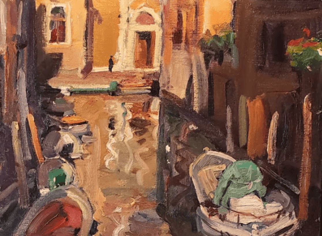
That is also where commercial judgment becomes practical. A classical painting with layered handling, like Tony Green’s Venice-based Renaissance approach, can carry a room if the placement lets the surface breathe; pushed too close to strong lamps or reflective glass, it loses some of its depth. If the piece is meant for a specific wall, a commission may solve the proportion and lighting problem more cleanly than forcing a near-fit. And if you want a little more background on method before you compare surfaces and finishes, the about page gives useful context without turning the decision into a lecture.
Scottsdale’s market rewards clarity: not more excitement, but a cleaner read on how the work will live once it leaves the gallery and enters an actual home. That means asking one simple question before you close: if the frame, wall color, and lighting change, what part of the experience stays strong? If the answer is only the story, keep looking; if the surface, scale, and placement still hold together, you are close to the next decision.
Leave a Reply