
The room was already doing half the work: late afternoon light slid across a pale wall, caught the edge of a frame, and made the paint surface wake up in small, stubborn details. In Scottsdale, that kind of light changes everything. A canvas that feels modest in a showroom can read larger, sharper, or more fragile once it’s home, especially when the wall color, ceiling height, and distance from a sofa all start talking back to the work.
That is why fine art buying in Scottsdale is less a search for something pretty than a judgment call with several moving parts at once. You are weighing provenance against condition, medium against scale, placement against framing, and the quiet but decisive question of authenticity against how the piece will actually live in the room. A polished surface may hide repairs. A generous size may overwhelm a narrow hallway. A strong signature may mean little if the support is unstable or the history is thin. The useful questions are concrete: what exactly was used, how was it stored, what has been conserved, what documentation exists, and does the work fit the space you already have rather than the one you imagine.
As explored in earlier notes, the best purchases usually come from the same habit: slowing down long enough to compare the facts before the feeling takes over.
Table of Contents
- Evidence and paper trail: what to verify first
- Condition, medium, and conservation implications
- Scale, placement, and how the work lives in the room
- Authenticity, comparison, and when the story outruns the object
- How to use Scottsdale as context without outsourcing your judgment
Evidence and paper trail: what to verify first
The first thing to ask for is not a sales pitch but the paper that lets the work stand on its own: invoice history, exhibition records, prior ownership, and any conservation notes. A clean provenance chain does not need to be elaborate, but it should be legible, with names, dates, and a path you can follow. If the seller cannot produce that backbone, the offer is already weaker, because the story is then carrying more weight than the object.
That is where fine art buying in Scottsdale becomes less about atmosphere and more about evidence. A work shown at a fair such as the Kierland Fine Art & Wine Festival may arrive with polished presentation, but presentation is not provenance; ask what can be verified independently. Compare the seller’s account against labels, gallery stamps, catalogue entries, and any public record you can match through a source such as Getty Proven.
Thin proof changes the decision quickly. If the ownership trail has gaps, if the medium is described loosely, or if the measurements do not match the frame and support, the asking price should drop or the purchase should pause. For a Venice-based Italian/American Renaissance painter working with classical methods like Tony Green, a buyer can reasonably request a signed invoice, the exact dimensions unframed and framed, and a note on whether the surface has been cleaned, relined, or otherwise altered; those details tell you whether you are comparing like with like, not just admiring a surface.
If the documentation is strong, the conversation gets sharper rather than softer: you can ask what was conserved, when, and by whom; whether the work has been reproduced in a catalogue or studio archive; and whether the title matches the object in hand. That is the point at which the next question becomes practical rather than speculative, because once the proof is credible, the next decision is whether the object’s condition and medium can carry the value being claimed.
Condition, medium, and conservation implications
The first thing to inspect is not the signature or the story, but the surface in front of you. A painting in oil on linen can tolerate one kind of handling; a work on paper, a tempera panel, or a mixed-media piece asks for a different standard. Look closely at craquelure, abrasion, lifting pigment, stretcher marks, discoloration, and any old repairs. If the work has a condition report, compare it against what you can see under raking light and ask for the date of that report. If the seller can only describe condition in general terms, ask for a fresh report with measurements and close photographs before any money moves.
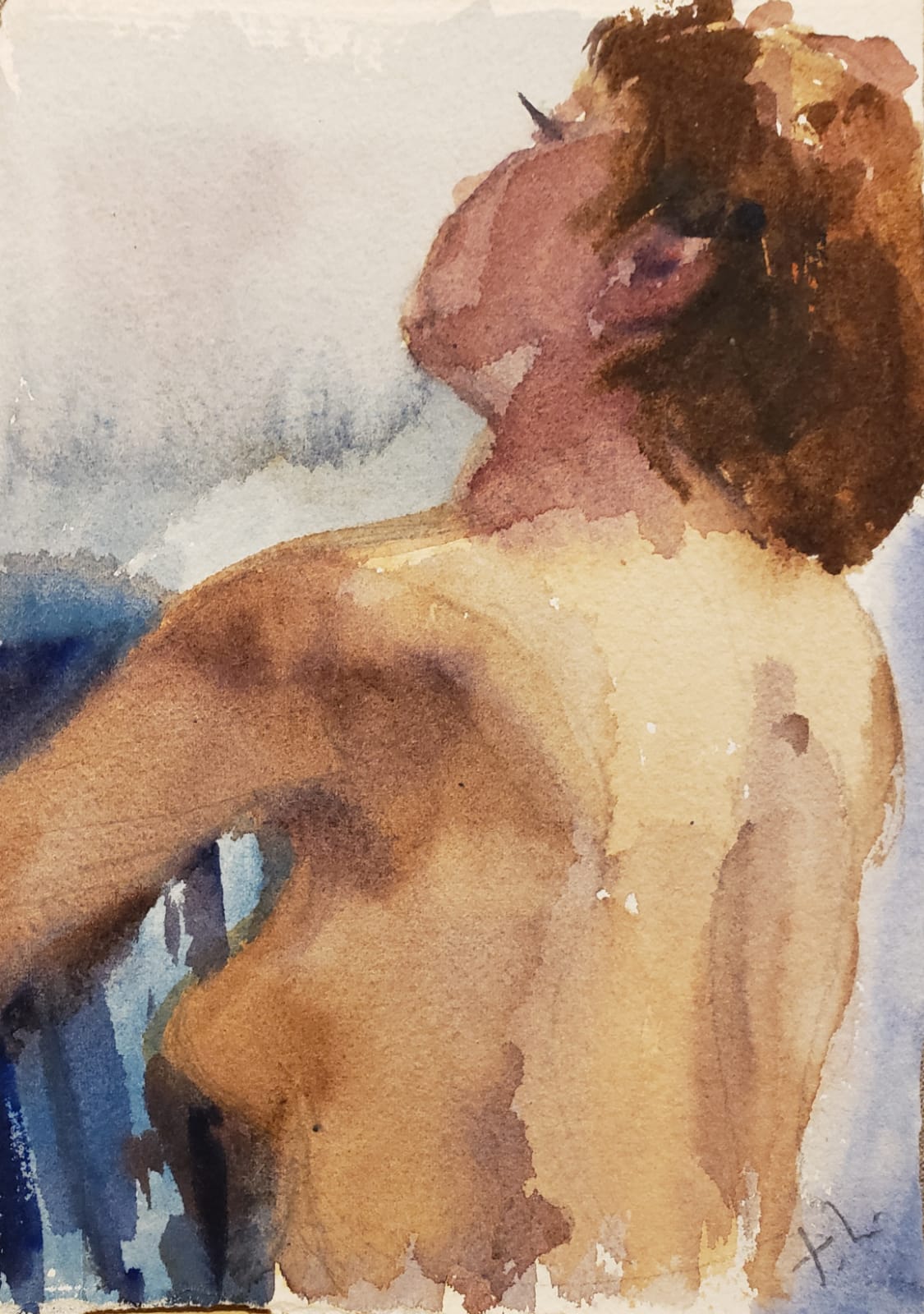
Medium changes the conservation conversation immediately. Acrylics can appear stable until heat, varnish, or poor framing has altered the surface; oils may darken or yellow; works on paper may be vulnerable to mat burn, foxing, or exposure at the edges. Ask what was used for the support, ground, binders, and varnish, and whether the work has been cleaned, relined, or inpainted. A buyer should be able to say, “Has this been retouched, and if so, where and by whom?” That one question often reveals whether a price is attached to an untouched object or to a carefully restored one. For an artist’s own method and materials, Tony Green’s About page is useful background; it helps you compare what is stated publicly with what is in front of you.
Zoom out for a second. Condition also affects how the work will live in Scottsdale light, which can be unforgiving through large windows and bright interiors. Measure the wall space, note the distance from direct sun, and ask whether the frame has UV glazing, museum board, or spacers that keep the surface from touching the glass. If the piece is being bought for a specific room, bring the room dimensions into the conversation: height, width, and viewing distance. A work that reads elegantly at a dealer’s salon may feel cramped above a low console or too delicate across a broad wall. If the fit is uncertain, a commission can solve more than scale; it can align medium, finish, and placement from the start through Tony Green’s Commission page.
The final comparison is between the object’s physical demands and the price being asked.
Scale, placement, and how the work lives in the room
The first decision is usually not the purchase. It’s the standard. A painting that feels commanding in a white-walled gallery can look hesitant once it meets a sofa back, a doorway, or a run of windows. Measure the wall width, the furniture beneath it, and the height of the sightline from the main seat. If the work is framed, include the frame in every dimension; a generous profile can add several inches and change the whole read of the piece.
Bring the room into the conversation before money changes hands. Ask for exact height and width, then compare that to the actual span of wall you have, not the imagined one. A useful rule is to leave breathing room at the edges so the work feels placed, not squeezed. In Scottsdale homes with bright glazing and hard surfaces, that margin matters even more because light and reflection can flatten detail fast. A work that arrives from a source like Tony Green’s shop may already show its medium and scale clearly, but the room decides whether those qualities read as elegance or clutter.
Zoom out for a second. Placement is not only about width; it is about height, glare, and the angle from which the piece will actually be seen. If the work will hang across from a western window, ask how the surface responds to direct sun and whether the frame or glazing introduces shine. If it is intended for a hallway or stair landing, check whether the composition still resolves from a passing glance. When the fit is uncertain, a room-specific solution through the commission page can be the cleaner answer, especially if you need a custom dimension, a particular finish, or a painting built to sit above a console, mantle, or bed.
The strongest buyers compare more than inches. They compare the work’s visual weight to the wall, the frame to the architecture, and the lighting plan to the surface. A classical painting, especially one shaped by Tony Green’s Venice-based Italian/American practice, can ask for deeper shadow and calmer placement than a glossy contemporary print. If the piece is available to view in context, even a single photo at hanging height can reveal whether the proportions are right. Once the room test passes, the next question is whether the object’s story is as solid as its presence.
Authenticity, comparison, and when the story outruns the object
The first decision is usually not the purchase. It’s the standard. If a seller says a work is original, period, studio-made, or by a named hand, ask what on the object supports that claim: signature placement, verso marks, stretcher or panel construction, materials, and any paperwork that ties the piece to a sale or exhibition. A strong answer is specific enough that you can compare it against the work in front of you, not just the romance around it. Comparison is where Scottsdale buyers stay sharp. Set the piece beside two or three credible examples of the same artist, medium, or period and look for repetition in handling, scale, and finish. If a painting is presented as an early study but carries the polish, framing, and market language of a later showcase work, that mismatch deserves attention. The same is true when the asking price leans on biography while the object itself reads as modest in method , support, or dimensions. Two questions cut through most uncertainty: “What document would you show a second buyer?” and “What visible feature would let me identify this work if the label were removed?” If those answers are vague, the sales language is doing more work than the object. For artists with a classical practice, including Tony Green’s Venice-based Italian/American work, the discipline is to separate visual authority from market narration; the work should hold up when the story is set aside.
How to use Scottsdale as context without outsourcing your judgment
Scottsdale is useful because it compresses a lot of viewing habits into one market: bright interiors, polished hospitality lighting, and buyers who often imagine the work in a home before they have decided what wall it will live on. That makes the gallery visit a test of translation. A painting that feels resolved under clean, even light should still feel legible when the light turns warmer, the room gets deeper, and the distance to the sofa changes. If you are comparing pieces, ask for the image to be held at the height and angle it will likely have in your space; that single adjustment often tells you more than a long sales pitch.
Placement is where the decision becomes real. Before purchase, measure the exact wall width, ceiling height, and the main viewing distance where the piece will land; then compare those numbers with the work’s visible image size, not just the outer frame. A piece that seems commanding in a showroom can feel overbuilt above a narrow console or disappear across an open room if the negative space around it is too generous. Ask one practical question: “If I hang this at standard eye level, what should I expect to change in the viewing experience when it leaves the gallery?” That forces the conversation toward lighting, reflection, and scale instead of vague enthusiasm. When you want to compare available formats and see how medium and size alter presence, the Shop is the faster reference.
For rooms with difficult light, commission becomes the smarter next move than forcing a near-fit.
Leave a Reply