In a Santa Fe room, afternoon light can be unforgiving in the best way: it skims a plaster wall, catches the weave of a linen canvas, and suddenly the question is not whether a painting is “good,” but whether it holds its ground at that scale, in that light, with that furniture and that distance. A work that feels generous in a gallery can look crowded above a narrow console, while a quieter piece can open a whole wall if the surface, frame, and color temperature are working together.
That is why buying well is less about making a fast aesthetic leap than about making a clean judgment. Before money changes hands, the useful questions are concrete: who handled the work, what can be verified about provenance, what condition issues are visible, what medium and support are you actually buying, how large is it in real space, how will it live with the light where you plan to place it, and whether the piece is authentic, properly described, and a fit for the room you have rather than the room you imagine. In Santa Fe, where serious collectors look closely and the market rewards discernment, those details are not paperwork afterthoughts; they are part of the value.
If you want the fuller checklist, the earlier notes set the frame, and this guide follows it by making each decision visible before purchase.
Table of Contents
- Evidence and paper trail: what to verify first
- Condition, medium, and conservation implications
- Scale, placement, and how the work lives in the room
- Authenticity, comparison, and when the story outruns the object
- How to use Santa Fe as context without outsourcing your judgment
Evidence and paper trail: what to verify first
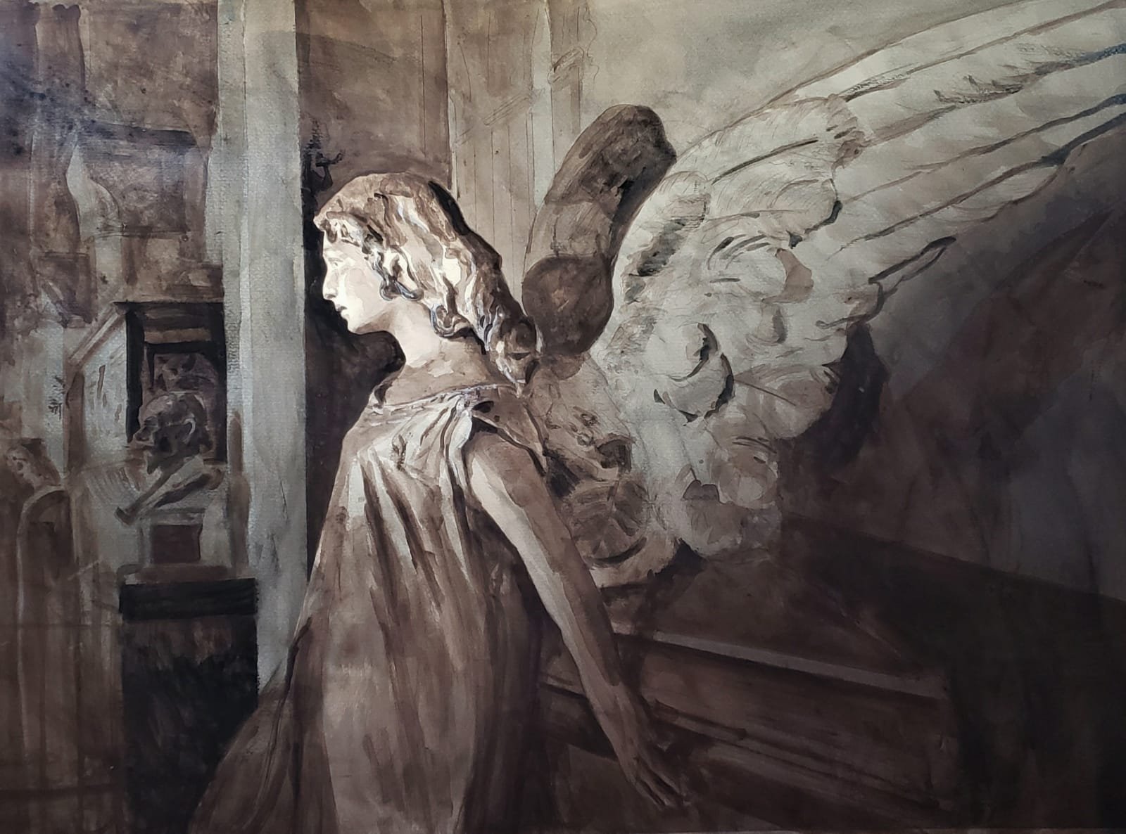
Start with the oldest, simplest question: what proves this object is what the seller says it is? Ask for the invoice trail, prior sale records, exhibition history, and any conservation or framing paperwork before you discuss price. A clean story has names, dates, and dimensions that line up; a thin one leans on adjectives. If the work is presented as a painting with classical methods, the documentation should support the medium, support, and scale with the same precision you would expect from the image itself. Tony Green’s About page is useful here because it shows the kind of studio background and method a serious buyer should be able to compare against the offer.
Thin proof changes the decision fast. A gallery label with no artist statement, no previous owner, and no condition note is not neutral; it adds risk you will have to price into the purchase. Ask one direct question: “What document would you hand me if I needed to resell this tomorrow?” If the answer is a receipt, a certificate, or a provenance sheet, check whether the names, dates, and dimensions match the object in front of you. A mismatch in size, medium, or title is usually more revealing than a polished sales pitch.
For higher-value work, ask for the provenance chain in writing and compare it against independent records where possible. The Getty Proven. resource is a practical reference point when the ownership story needs confirmation, especially if the piece has changed hands more than once. When the paper trail is incomplete, that does not automatically rule the work out, but it does change the terms: you are no longer buying certainty, only a claim that still needs support. At that point, the next useful comparison is whether the object’s condition and medium can carry the value being claimed.
Condition, medium, and conservation implications
Once the paper trail stops being the loudest part of the conversation, the object itself has to answer. In Santa Fe, where buyers often compare a quiet tempera panel against a heavily worked oil or a mixed-media surface, the first question is not whether the piece looks beautiful under gallery light; it is how the surface is holding together. Look for craquelure that reads as age rather than stress, check whether varnish has yellowed unevenly, and ask what has been cleaned, relined, repaired, or retouched. Those details change both longevity and value, even when the paperwork is clean.
Medium matters because different materials age in different ways. A work on canvas may tolerate a larger format, but it can sag, warp, or show stretcher marks; a work on panel can stay crisp for decades, yet it is more vulnerable to cupping and impact damage; works on paper need a different level of control altogether. If the seller says the piece is stable, ask for the support, the dimensions, and the date of the last conservation review in writing. If a work has a restoration history, compare the visible repairs to the asking price and ask whether any treatment is reversible. That conversation is easier when the artist’s method is documented clearly, which is one reason the process notes on About can be useful before you commit.
For a buyer, the practical test is simple: can this object live where you intend to place it without accelerating wear? Measure the wall, the sightline, and the distance from direct sun, heat, or humidity shifts, then ask whether the frame, glazing, or mount is appropriate for that exposure. A piece that feels right in a white cube can fail in a bright room if the pigments are sensitive or the framing is casual. If you are comparing available works, the Shop pages help you weigh scale and medium side by side; if the room is unusual or the placement is fixed, a commission may solve more problems than a forced fit.
Scale, placement, and how the work lives in the room
A work can be beautifully made and still feel wrong once it is on a wall. The Santa Fe buyer’s advantage is that rooms here are often honest about scale: adobe texture, tall ceilings, deep shadows, and a lot of daylight make size read differently than it does online. Before you commit, measure the wall width, the clear height above furniture, and the viewing distance from the main seat or entry. A painting that looks restrained in a listing may need more breathing room than you expect, while a smaller panel can disappear if it is hung where the eye has to travel too far.
Framing changes that calculation more than most people admit. A narrow gilt frame can tighten a classical picture; a heavier profile can give a contemporary work enough presence to hold its ground against stone, plaster, or a large hearth. Ask for the framed dimensions, not just the image size, and compare them to the wall opening or furniture span you already have. If the work has a strong edge or a painted border, confirm whether glazing is planned, because glare from a window or a pendant light can flatten the surface and make the room feel less settled.
Light is the other test that matters. In a bright adobe interior, a painting may need to live away from direct sun and a few degrees off the strongest beam from the window; in the evening, the same piece may come alive under a warmer lamp. Ask for a photo in natural light and, if possible, one under interior lighting so you can compare how the color shifts. That is where a clear conversation with the artist matters, especially if you are weighing available work against a custom fit; Tony Green’s About page gives useful background on the classical approach behind the surface, while the Shop helps you compare actual scale and medium before the piece ever reaches your wall.
If the room is fixed but the fit is not, a commission can solve what a search cannot. Bring the wall measurements, a quick phone snapshot, and the height of nearby furniture, then ask how the composition would read from the main sitting distance and where the visual center should land. That last detail decides whether the work feels anchored or adrift, and it is the point where the object stops being hypothetical and starts becoming part of the room.
Authenticity, comparison, and when the story outruns the object
That is where the story can outrun the object. A painting may arrive with a beautiful anecdote, but if the medium, canvas weave, stretcher, or frame tells a different story, the anecdote should lose. Ask for dimensions written two ways, image size and framed size, and compare them to the wall and to nearby furnishings; then ask one plain question: what would change if the provenance note were removed? If the answer is “not much,” the piece is probably carrying its own weight. If the answer is “everything,” the narrative may be doing more work than the painting.
Santa Fe makes this comparison instinctive because the market is full of strong visual traditions, from museum-grade reference points like O’Keeffe Mus. to the hum of gallery corridors on Canyon Road, and that density sharpens the eye rather than softening it. Even a public-facing moment such as the Santa Fe Raptor Center Visits can remind a buyer how quickly a compelling setting can heighten attention without proving authenticity. The disciplined move is to compare the object against another credible example, note what matches, and separate what is documented from what is merely persuasive.
When the object survives that comparison, the remaining question is fit at the level of commitment: does the scale, finish, and visual tempo still make sense for the room you actually live in, or only for the story you want to tell about it?
How to use Santa Fe as context without outsourcing your judgment
This is where placement becomes more than a hanging height. Measure the wall span, then compare it with the work’s visual mass, including frame if it has one, and imagine the negative space around it as part of the purchase. A large canvas that feels commanding in a white cube can become overbearing above a narrow console; a more intimate panel can disappear if the surrounding wall is too busy. If you are looking at pieces through Tony Green’s shop, compare the stated dimensions to the furniture, doorway, or sightline you already have in mind, and ask for a room photo or mockup when the fit is not obvious.
Lighting is the other test that happens after the sale. Classical surfaces, glazing, and hand-finished passages can shift dramatically when they leave a polished gallery and enter a house with warmer bulbs, stronger sun, or lower ceilings. Ask how the surface reads under direct light and from an angle, and whether varnish, gold, or tonal contrast will flatten or deepen once the work is installed. If you want the artist’s intent before the room starts negotiating with it, Tony Green’s background helps frame the method, and a conversation about a commission can resolve the last inch of scale before a piece is made for a specific wall.
That final step is usually the cleanest one: the piece has to live where you live. A work that looks resolved in Santa Fe’s gallery circuit may reveal a different tempo once it is carried through your doorway, placed opposite a window, and seen at breakfast instead of under opening-night light.
Leave a Reply