
Late light in Santa Fe can make a plaster wall glow softly for ten minutes, and then turn severe the next. A painting that looked calm on a gallery floor can suddenly feel too small above a long bench, or too loud beside hand-troweled texture and an old wood beam. The room is not just holding the work; it is testing it for proportion, surface, and whether the frame earns its place.
That is why lasting art choices are less about liking a piece in the moment than about judging what will still hold up after the excitement fades: who made it, where it came from, what condition it is in, what medium and support were used, how the scale relates to the wall and furnishings, whether the placement will flatter or fight the light, and whether the work is authentic in both paperwork and presence. In a market like Santa Fe, those questions protect the purchase as much as they shape the look of the room, which is why the buying conversation should be specific: ask for provenance, compare dimensions against the actual wall, inspect edges and surface wear, and make sure the piece can live with your space rather than merely fill it.
If you have read the earlier notes, this next pass turns those instincts into a practical checklist for choosing work that belongs now and still makes sense years from now.
Table of Contents
- Evidence and paper trail: what to verify first
- Condition, medium, and conservation implications
- Scale, placement, and how the work lives in the room
- Authenticity, comparison, and when the story outruns the object
- How to use Santa Fe as context without outsourcing your judgment
Evidence and paper trail: what to verify first
The first decision is usually not the purchase. It’s the standard. Before you talk about price, ask for the clearest proof the work can offer: who made it, when, in what medium, and with what record behind it. A signed invoice, exhibition history, gallery label, or studio note may sound ordinary, but those details change the conversation fast; thin proof forces a buyer to discount the story, while a clean paper trail gives the work room to hold its value.
For a collector weighing how to choose art that lasts in Santa Fe, provenance should read like a chain, not a slogan. Ask, “Can you show me the ownership history from the artist or first seller to now?” If the answer is vague, compare that hesitation against the object itself: does the signature align with the period, are the dimensions exact, is the medium described consistently across documents? A painting that arrives with contradictory titles, loose dates, or missing source notes asks you to pay for uncertainty; that is rarely the right starting point, even when the surface looks strong.
Let’s make it practical. At a student exhibition opening such as SFCC Student Exhibition Opening, you can see how documentation begins at the wall label: medium, size, and artist name, all in plain view, and those basics are what later become the buyer’s first cross-check. The same habit applies to established work from Tony Green’s atelier background and classical method; if you are comparing available pieces through the shop or considering a room-specific commission, ask for the exact support, dimensions, and any prior exhibition or collection record before you get attached to the image.
When the evidence is solid, the work can be judged on its own terms. When it is thin, the price should fall with it, because the next question is no longer whether the piece is beautiful; it’s whether the condition and medium can carry the value being claimed.
Condition, medium, and conservation implications
Once the proof is credible, the next decision is physical: whether the work is healthy enough to justify the price being asked. In Santa Fe, where collectors often compare a new purchase against pieces that have already lived through strong light, dry air, and long display cycles, surface stability matters as much as image quality. A clean frame can hide a lot, so ask for the plain facts: what is the support, what is the medium, and what has changed since the work left the studio or last entered a collection?
The medium tells you how the piece will age. Oil on panel behaves differently from oil on canvas; tempera, gilding, and mixed media each bring their own risks; and classical methods, such as those used by Tony Green, reward careful handling but still need honest scrutiny of cracking, lifting, abrasion, and previous restoration. If a work has an older conservation report, read it against the current surface under raking light and ask whether varnish has yellowed, whether retouching is visible, and whether the support is sound. That is where a provenance file and the object itself should agree, clause for clause, without drama.
Buyers should also pin down measurements that affect both care and placement: exact image size, framed size, depth, and weight. A painting that looks moderate in a photograph can overwhelm a narrow wall once framed, or sit too close to heat vents and direct afternoon light. Ask for a straight answer to one practical question: if this arrives in my room, what will it need in the first week to stay stable? If the answer involves UV-filtering glazing, a different hanging height, or a custom frame, that is useful information, not an inconvenience. For available work and stated medium or scale, the shop gives you a baseline; for room-specific needs, commission can be the cleaner route.
Pro tip: Before paying, ask for three things in writing: the exact medium and support, the current condition notes with close-up images of any wear, and the framed or unframed dimensions measured to the nearest quarter inch.
- Compare those numbers to your wall space and lighting plan.
- Ask whether the surface has been cleaned, varn
Scale, placement, and how the work lives in the room
The first test is not whether the piece is beautiful under gallery light; it is whether it can live on your wall without asking the room to reorganize itself around it. A work that reads as balanced in a high-ceilinged gallery can feel unexpectedly small over a mantel, while a tightly composed panel can overpower a narrow hallway. Measure the wall, the furniture line beneath it, and the viewing distance. If a painting is likely to hang above a sofa, leave enough breathing room that the top edge does not crowd the crown or disappear into upholstery; if it is for a passage, check the sightline from both directions so the image does not collapse into a blur when seen in motion.
Framing changes that calculation. A wide linen liner or deep profile adds presence, but it also adds inches that matter in Santa Fe homes where plaster texture, vigas, and sunlit corners already carry visual weight. Ask for the framed and unframed dimensions separately, then compare them to the actual opening you have in mind. If the work is on panel or canvas and you prefer a cleaner edge, confirm how the sides are finished and whether the object can hang flush or needs a shadow gap. When a seller can supply a mockup or a photo of the work scaled into a real interior, that image often reveals more than a description ever will.
Light is where a piece either settles into the room or starts fighting it. North light can preserve tonal subtlety; direct afternoon sun can flatten delicate modeling and punish surfaces over time. If the work has glazing, watch for reflections from lamps, windows, and nearby brass or glass objects. If it is an unglazed surface, look at how the texture behaves under your own lighting at home, not just in the studio. Tony Green’s background in classical methods makes surface and finish especially relevant, and the same is true when you compare available pieces in the shop: the closer you get to the actual room, the easier it is to tell whether the scale is elegant or merely large.
For a room-specific fit, the useful question is concrete: what is the exact wall width, what hangs beside it, and from what distance will you usually see it?
Authenticity, comparison, and when the story outruns the object
A useful buyer’s question is specific: what documentation can be shown beside the work itself, and what part of the attribution is visual rather than verbal? For a classical painter such as Tony Green, whose Venice-based practice is rooted in Renaissance methods, the object should reward close looking—layering, edges, surface decisions, and the discipline of execution should be visible even before you read the title card. If you want to compare available work by medium and scale, the shop gives a clearer baseline than a sales pitch, and the about page helps you separate method from marketing.
In Santa Fe, that discipline matters because the market is full of pieces with strong regional stories and uneven physical claims. A work can be perfectly authentic and still be the wrong fit if the scale overwhelms the room or the surface disappears under glass glare, but the reverse is also true: a modestly sized panel with real presence can outlast a louder object that relies on lore. When a seller describes a piece, compare the language to what you can measure, photograph, and verify. If the story sounds larger than the object, ask for a straight comparison to one or two other credible examples, ideally with dimensions, medium, date, and condition side by side.
When the room is known and the object is credible, the next decision is whether you need a finished work or a commission shaped to the wall, the light, and the viewing distance. That is where a direct conversation helps more than a vague promise, especially if you are balancing authenticity with fit and want the piece to feel inevitable rather than merely acquired.
How to use Santa Fe as context without outsourcing your judgment
That is why placement belongs in the conversation before purchase, not after. Ask for the work’s exact dimensions, then compare them to the wall you have in mind with painter’s tape or a paper template; if the object is meant to sit above a console, measure the furniture width as well as the clear wall span. If you are considering work from the shop, look at scale alongside medium and surface, because a classical painting with subtle value shifts needs a different amount of breathing room than a more graphic piece. A simple question helps: “Will this still read from twelve feet away, and what changes when it is framed?”
Light is where Santa Fe teaches restraint. North light can preserve nuance, while strong afternoon sun can wash out delicate passages or create glare on varnished surfaces; even a beautiful painting can become difficult if it sits opposite a bright window. Ask where the work was viewed in the gallery and whether it was lit by spotlights, skylight, or ambient room light, then imagine the same surface under your own fixtures. If you want a room-specific solution, a direct commission conversation is often more useful than trying to force a finished piece into an awkward corner.
That last step is where Tony Green’s practice matters.
Pro tip: Use Santa Fe as context, not as permission to skip judgment.
- Let local galleries sharpen your eye without outsourcing the decision.
- Bring the same standard back to the work, the wall, and the documentation.
- End with one action the buyer can actually take.
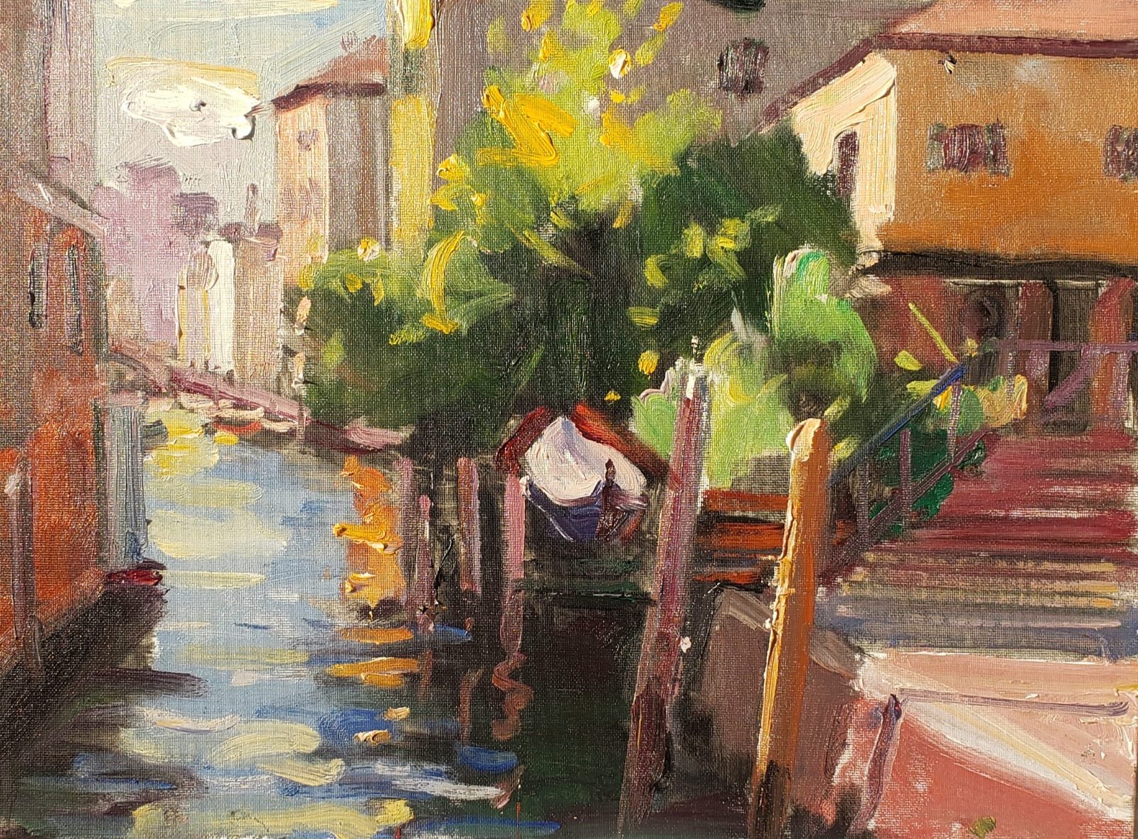
SQUERO A CANNAREGIO
Leave a Reply