
Late afternoon in Santa Fe has a way of exposing everything at once: the pale wall, the shadow line at the baseboard, the weave of a rug that suddenly feels busy, the painting that looked settled in the gallery but now hangs a little too high, or too small, or too loud for the room. In that light, scale stops being an abstraction. A picture either sits with the furniture and the plaster, or it starts to argue with them.
That is why buying art here is less a question of taste than of judgment. The better purchase is the one you can explain in plain terms: where it came from, what condition it is in, how it was made, how it will age, and whether its size and presence actually belong in the space you have for it. Provenance, medium, support, frame, surface wear, authenticity, and placement all affect value, and they affect it in different ways. A work on paper asks for different scrutiny than a panel, a painting with old restoration needs different comparison than one that has never been touched, and a strong image in the wrong scale can still be the wrong buy.
This guide builds on the earlier notes and moves straight into the questions that matter before money changes hands.
Table of Contents
- Evidence and paper trail: what to verify first
- Condition, medium, and conservation implications
- Scale, placement, and how the work lives in the room
- Authenticity, comparison, and when the story outruns the object
- How to use Santa Fe as context without outsourcing your judgment
Evidence and paper trail: what to verify first
If the image is strong, the first thing I want is not a flattering story but the paperwork that can support it. Ask for the oldest available invoice, gallery receipt, exhibition history, and any conservation or framing records; if the work has changed hands through an auction, request the lot details as well. A clean chain of ownership matters more than a polished sales pitch, and a thin file should change the price conversation immediately.
For a buyer in Santa Fe, the useful question is simple: what can be proven without interpretation? Who owned it, when was it shown, and is there a document that ties this exact object to the artist or estate? If the seller can only offer a verbal account, the offer should be treated as unverified. I would also ask for one comparison point—a catalog image, a past exhibition label, or an archive entry—so the title, dimensions, and medium can be checked against something external, not just the current listing.
Provenance is not just a prestige word; it is the difference between a confident purchase and an expensive assumption. A work with gaps in ownership, missing dates, or vague attributions needs a harder discount or a slower answer. When the evidence is solid, the next step is much cleaner: compare the object in front of you with the documented record, then move to the physical questions that the paper trail cannot answer. If you want background on the artist’s method and standards, the About page is the right place to start before you evaluate the work itself.
That sequence also keeps later judgments honest.
Condition, medium, and conservation implications
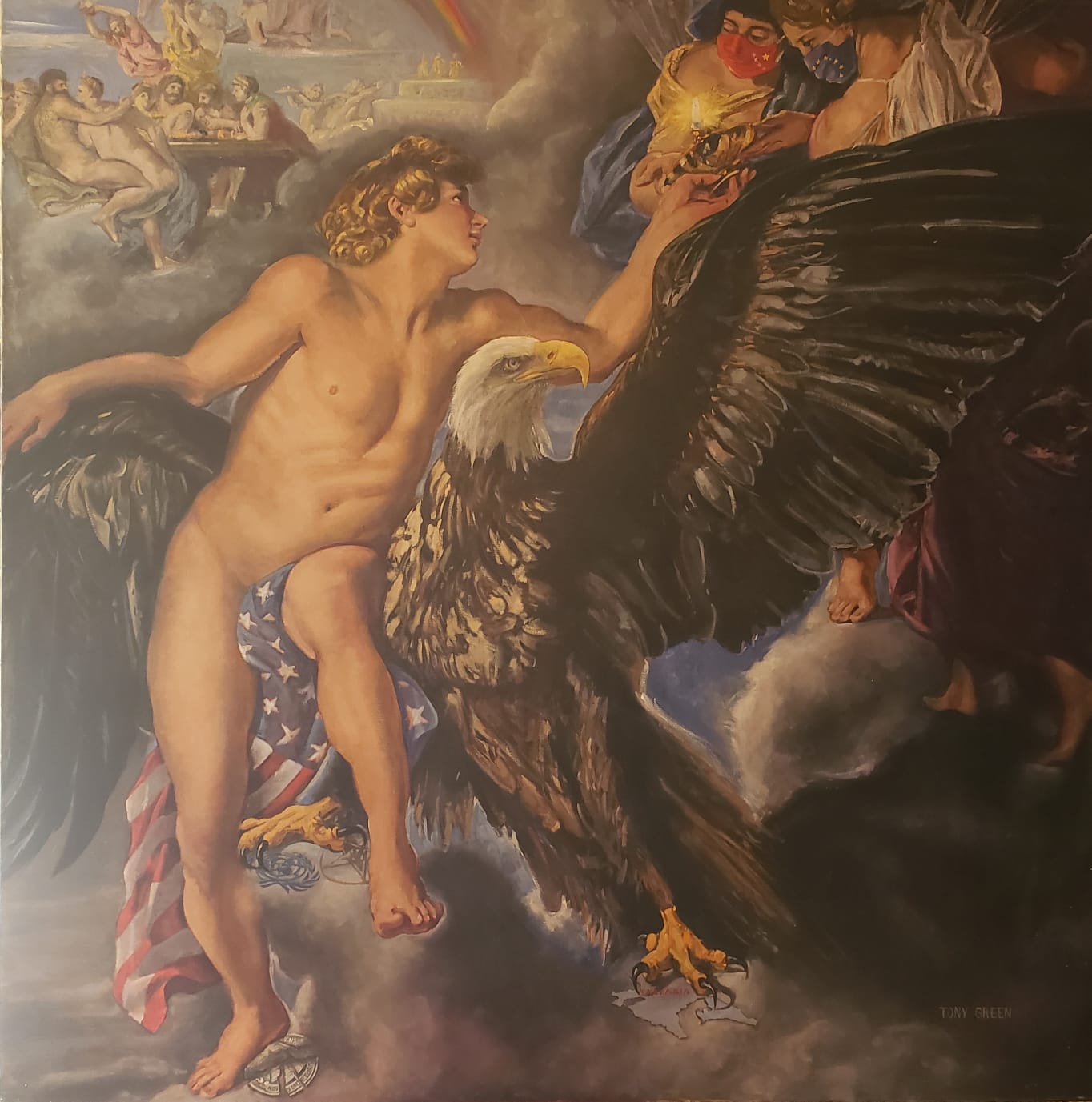
Once the record feels credible, the object has to earn the number in the room. A painting with strong provenance can still be a weak purchase if the surface has been overcleaned, the varnish has yellowed unevenly, or the support has begun to move. In a market shaped by serious collectors and cautious capital, those are not cosmetic details; they change how long the work can be displayed, how often it will need attention, and whether the asking price still makes sense against comparable material. If the piece is by Tony Green or another classically trained painter, ask for the medium, support, and date of execution in writing, then compare that to the visible finish and handling. A seller who can answer those points cleanly usually understands the object well enough to discuss its care history, not just its story. Opening Reception | Lucid Perturbations: The Sewn gives you a public counterpoint here: it shows how much presentation can shape first impressions before the work has to stand on its own.
Medium drives the conservation outlook. Oil on linen behaves differently from oil on panel; egg tempera, mixed media, and gold leaf each carry their own risks around cracking, abrasion, and light sensitivity. A buyer should ask, “Has the surface been conserved, stabilized, or relined, and by whom?” and “What is the recommended light level for display?” Those questions are practical because they tell you whether the work belongs in a bright living space, a controlled hallway, or a room that will need UV-filtered glazing and careful hanging hardware. If the piece is framed, measure the framed depth, the visible image size, and the full outer dimensions before you commit; those numbers matter for transport, placement, and insurance, especially when a work is being compared to available pieces on the shop or to a custom fit discussed through commission.
Condition should be read in layers. Look first for planar issues—warped panel, slack canvas, lifted gilding, bent stretcher bars—then for surface issues such as craquelure, abrasion at the edges, retouching, or pigment loss in high-touch zones. Ask for close photographs under raking light and, when the value warrants it, a condition report that notes prior repairs and any unstable areas.
Scale, placement, and how the work lives in the room
Once the surface questions are settled, the real test is physical: can the work hold its own where you intend to live with it? In Santa Fe, buyers often picture a piece against plaster, adobe, or a long gallery wall, but the room sets the terms. A painting that feels commanding in a dealer’s space can collapse over a narrow console, while a smaller panel can become the sharpest thing in the house if it sits at the right height and clears the furniture line. Measure the wall, the furniture beneath it, and the viewing distance before you commit; those numbers tell you more than a polished sales pitch.
For a work above a sofa or sideboard, compare the image width to the furniture width, not just the wall. A useful check is whether the art spans roughly two-thirds to three-quarters of the piece below it, with enough breathing room on each side that it does not look pinned in place. If you are considering one of Tony Green’s classical works, the shop makes it easier to compare dimensions and format side by side, which matters when you are deciding between a vertical portrait, a horizontal landscape, or a more intimate panel. Framing changes that calculation too: a deep frame can add presence, but it also adds projection and weight, so confirm the outer dimensions, not just the image size.
Light is the other silent coauthor. North light is forgiving; direct sun will punish varnish, gilding, and delicate pigments, and even a bright lamp can flatten a work if it sits too close or at the wrong angle. Ask where the piece will be seen at noon, at dusk, and at night, because those are three different purchases in practice. If you need a room-specific fit, a commission can solve proportion, palette, and placement in one step; Tony Green’s commission page is the right place to start that conversation, especially when the wall is fixed but the composition still needs to be tailored.
Pro tip: Before buying, tape the exact outer dimensions on the wall and stand in the room from the farthest seat and the main entry.
Authenticity, comparison, and when the story outruns the object
Comparison is the quickest antidote to romantic language. Place the work beside two or three credible examples from the same hand or period and look for repeatable traits: how the edges behave, whether the palette holds in shadow, how the brushwork resolves around the focal point. Tony Green’s About page is useful here because it frames method and classical approach without the fog of sales copy; that gives you a baseline to test against. If the piece is being priced as especially rare, ask what makes it distinct in medium, size, or state of completion, not just in story.
When the object passes those tests, the remaining decision is practical: is this the right work for the space, or the right commission to complete it? That is where a collector can move from comparison to placement with confidence, and if the answer is still uncertain, the next conversation should be about dimensions, finish, and how the light will strike it in the room.
How to use Santa Fe as context without outsourcing your judgment
In Santa Fe, the market can make a piece feel more persuasive than it really is: adobe walls flatten glare, high desert light sharpens color by midday, and a work that looks restrained under gallery track lighting may come home and suddenly feel louder, cooler, or more reflective than expected. That is useful context, not a verdict. The collector’s job is to ask how the work behaves in the actual room, not how well it performed in a polished white cube on Canyon Road or beside a museum-caliber installation at the O’Keeffe Mus.
Pro tip: Before you commit, ask for one simple comparison: “Can I see this work in a room-size photo with the intended frame and lighting temperature?” That single image will tell you more about placement than a polished install shot.
- Confirm the exact outer dimensions, not just the image size.
- Ask how the surface reads in warm light and in daylight.
<
Leave a Reply