Category: Blog

  • Collecting art in Santa Fe: A practical guide for collectors

    Collecting art in Santa Fe: A practical guide for collectors

    Late afternoon in Santa Fe can make a room feel edited. A pale wall goes amber near the window, a woven rug holds its color in the shade, and a canvas that seemed modest in the gallery suddenly claims the whole field of view. That is the moment collectors remember later: not the tag, but the way scale settles against the furniture, how a frame catches light, how texture changes when the sun drops and the adobe tones deepen.

    The better buying decision starts there, but it cannot end there. In this market, the useful questions are practical: who handled the work before you, what condition report exists, whether the medium is stable in your climate, how the dimensions will read once it is installed, and whether the piece belongs in the room you actually have rather than the one you imagine. Provenance, authenticity, framing, placement, and fit are not separate chores; they are the terms that tell you whether the work belongs on your wall or only in your shortlist.

    This guide takes that standard seriously, building on earlier notes and turning it toward the checks that matter before a purchase is final.

    Table of Contents

    Evidence and paper trail: what to verify first

    The first thing to ask for is not a sales pitch but a record: who owned the work, when it changed hands, and what documents support that trail. A clean invoice, a dated certificate, exhibition history, and any old labels on the back tell a buyer more than a polished story ever will. If a seller can produce only a verbal account, the asking price should drop in your mind immediately; the burden of proof has shifted to you, and thin proof weakens the case before you even reach condition or medium.

    Ask a direct question: “What document would you hand to a future buyer to support attribution and ownership?” Then compare the answer against what is actually in the file. A gallery receipt with title, dimensions, medium, and signature is stronger than a generic note; a conservation report is stronger still if the surface has been touched. For older work, I look for correspondence, exhibition checklists, or a published reference that can be cross-checked against the object itself, and I will often use the Getty Proven. database as a sanity check rather than a finish line.

    Thin proof changes the decision because it changes your exit. Without documentation, resale becomes harder, insurance becomes fussier, and any future question about attribution lands back on you. That matters even in a market with strong taste and active galleries: a work can be beautiful and still be poorly supported. If you are comparing a documented piece with one that arrives as a story, the documented piece usually deserves the premium, especially when the seller cannot explain gaps in ownership or identify where the work was shown.

    For artists whose process matters to the value, ask for one concrete comparison: a photograph of the front and back, plus the exact dimensions measured edge to edge, not rounded estimates. If the work is one of Tony Green’s, his About page gives you the background to compare method and authorship, while the Shop page helps you match listed medium and scale against the object in front of you. Once the paper trail feels solid, the next question is whether the object itself can carry the value being claimed.

    Condition, medium, and conservation implications

    The first thing to inspect is not the signature line or the label on the back; it is how the surface behaves under light. In Santa Fe, where collectors often compare works across adobe-shadowed rooms and bright, high-dry interiors, condition can change the economics fast. A panel with stable joins, a canvas with even tension, and paint layers that sit cleanly on the support are easier to live with than a work showing lifting, cupping, abrasion, or old overpaint. If the piece is by Tony Green, use the About page for method and authorship context, then ask for a straight condition report: what was repaired, when, by whom, and with what materials. Medium matters because it predicts both care and risk. Oil on panel, oil on linen, tempera, gilded surface, or mixed technique each asks for a different conversation about humidity, glazing, and framing depth. A buyer should ask for the exact support dimensions, the image size, and whether the frame is original, later, or purely protective; those details affect shipping, placement, and future conservation. If the work is listed among current examples on the Shop page, compare the stated medium and scale against the actual object, then confirm whether the finish is matte, varnished, or intentionally burnished, because that determines how it will read under gallery lights and in a home. Small discrepancies deserve direct questions before money changes hands. Ask, “Has the work been cleaned, relined, consolidated, or revarnished?” and “Are there active cracks, flaking, or retouching visible under raking light?” If paperwork is available, keep the conversation narrow: one clause on provenance, one clause on condition, then move back to the object itself. A collector in Santa Fe who is weighing a wall piece against a room with strong afternoon sun should also ask for a photograph in natural light and one under the intended lighting temperature, because conservation risk is often a placement problem disguised as a taste problem. For room-specific fit, a commission can be the cleaner answer when scale or finish needs to be controlled from the start, which is where Commission becomes useful.

    Scale, placement, and how the work lives in the room

    The first decision is usually not the purchase. It’s the standard. A painting that looks composed in a gallery can go flat, or feel domineering, once it meets a low ceiling, a narrow wall, or a seating area that forces the eye to travel across the image from six feet away. In Santa Fe, where adobe surfaces and warm light can soften edges fast, ask for the exact dimensions of the work, the framed dimensions if it is framed, and a photo with a known object beside it. That gives you a usable scale check before you ever imagine it on your wall.

    Measure the wall, then measure the sightline. If the piece will hang above a sofa, console, or fireplace, compare the width of the work to the furniture below it and leave enough breathing room so the edges do not crowd the room. A common mistake is buying for the image and forgetting the frame; a deep frame or a wide float can add several inches and change how the work lands. If you are comparing two works from the shop, ask which one keeps the better proportion from the primary seating position, not just from close viewing. That question tells you more than a title ever will.

    Light is part of the object’s life, not a finishing touch. Natural light can reveal brushwork and surface, but it can also flatten contrast by afternoon; warm bulbs can enrich earth tones while pushing whites yellow. Ask for one image in daylight and one under the lighting temperature you actually use, then check whether the paint surface, varnish, or gilding reads cleanly without glare. If the work is a strong fit in size but the room is tricky, a conversation with Tony Green through the commission page is often the more precise move, especially when the goal is a specific scale, orientation, or placement above a mantle or in a stair landing.

    Framing deserves the same discipline. Frame profile, glazing, and mounting can either steady the image or make it feel overbuilt for the room. A simple frame may suit a quieter interior; a more assertive one can help a smaller painting hold its own on a large wall. Before you commit, ask for the artwork’s full depth, how it will ship, and whether the hanging hardware is centered for the intended orientation.

    A 90-second checklist before you buy

    For collecting art in Santa Fe, that quick pass matters because rooms here often ask for a strong presence without visual clutter. A smaller work can still command a wall if the framing is disciplined; a larger canvas can feel awkward if the margins are wrong or the support is too heavy for the location. Ask for a straight-on photo with a tape measure visible, then compare it to the wall opening you actually have, not the wall you imagine. If the work is from Tony Green’s shop, use the listed medium and size to test whether the piece reads as intimate, transitional, or architectural in your space.

    When the fit is close, one comparison usually settles the question: does the object feel consistent with the story attached to it? That means the medium, the condition, and the proposed placement all need to agree. A classical painting on panel, for example, should be presented with the kind of care that protects edges, surface, and light; a room-specific request may be better handled through commission work than by forcing a near-match into a difficult wall. Even at an event such as Opening Reception | Lucid Perturbations, the useful questions are the same: what exactly is it, how will it live on the wall, and does the scale justify the space it will occupy?

    That last check is where the sale becomes clearer.

    Authenticity, comparison, and when the story outruns the object

    A useful comparison is never only internal. Set the work beside two or three credible examples from the same hand or period, not just by image but by measurement and material behavior. If a painting is described as a large Renaissance-method oil, check whether the paint layers, panel or linen support, and finish actually behave that way; if the seller is using language that sounds more ambitious than the object, the gap will show. Tony Green’s About page is a straightforward place to verify method and working background, while the Shop gives a cleaner read on available scale and medium than a polished sales pitch ever will.

    This is also where the story can outrun the object. A work may arrive with a handsome chain of ownership, yet still fail the simplest comparison: the frame overwhelms the image, the dimensions do not suit the wall, or the surface asks for lighting that the room cannot provide. If the piece is being considered for a specific interior, a room-specific conversation through Commission is often more useful than forcing a near-fit into a difficult space. And if you want a broader provenance lens, the Getty Proven. guide is a better benchmark than casual reassurance.

    Pro tip: Before you commit, put three things side by side: the claim, the object, and one credible comparison.

    How to use Santa Fe as context without outsourcing your judgment

    In Santa Fe, the room is often doing half the talking. High light, adobe tones, deep portals, and a market that prizes quiet confidence can make a piece look finished before you’ve asked whether it still holds up in ordinary daylight. That is useful pressure, but only if you keep it in its place: the city can sharpen your eye for fit and presence, not replace the questions that matter when the sale language fades.

    For work by Tony Green, the most useful conversation is not whether the style “fits Santa Fe,” but whether the method, surface, and dimensions fit the room you have. His About page is the right place to understand the classical approach behind the work, while the Shop helps you compare available scale and medium against a specific wall, stair landing, or study. If the question is more exacting—a niche, a difficult alcove, a dining room that needs restraint rather than spectacle—then a commission can solve the mismatch cleanly instead of forcing a near-fit.

    That same discipline keeps the purchase honest in a market with strong taste and strong opinions. A piece should still work when you step back from the story and ask, “What exactly am I getting, where will it live, and what will I want to verify again if I resell or insure it?”

    collecting art in Santa Fe – Santa Fe
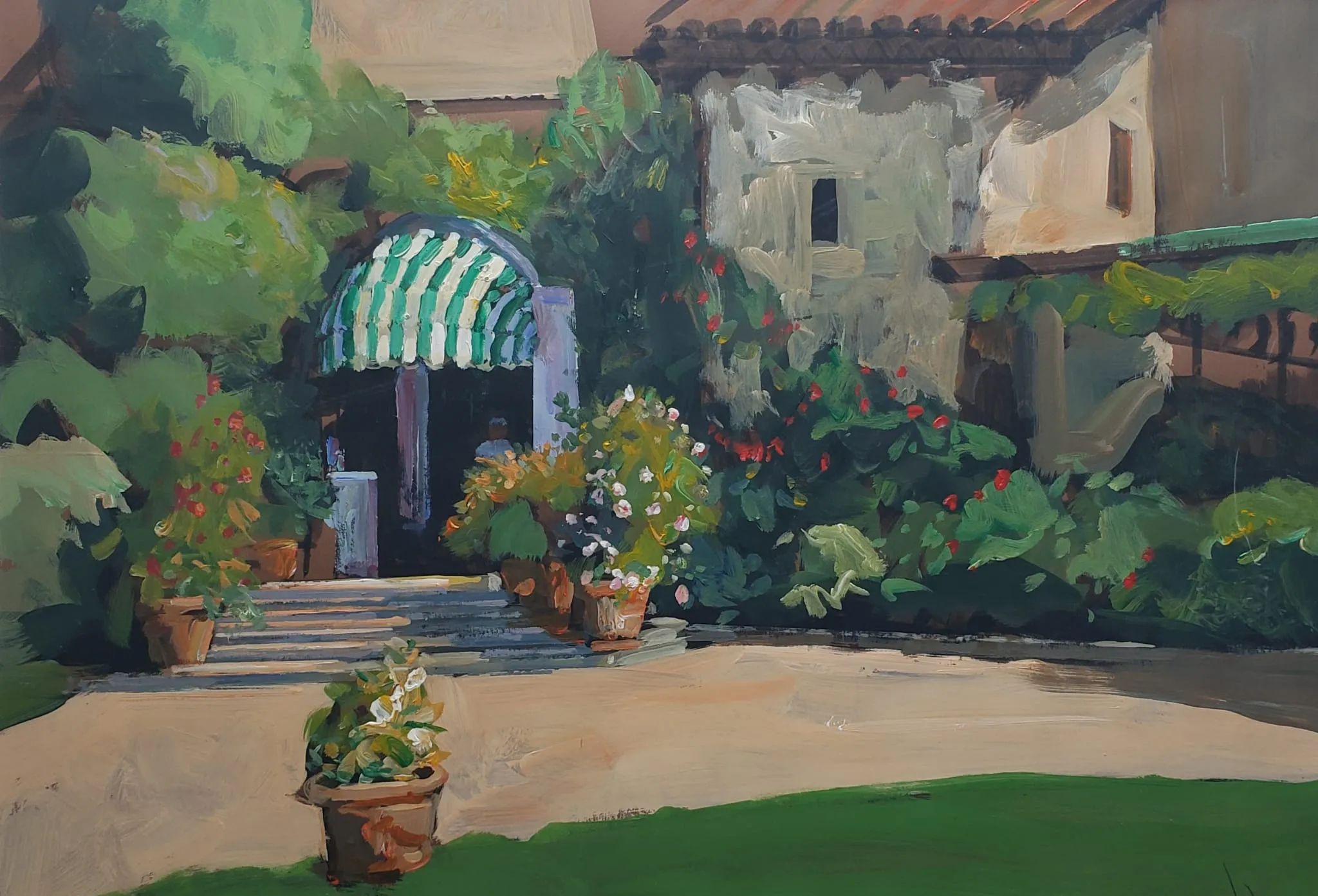
    ENTRANCE TO DUE ROCCOLI
  • Collecting art in Scottsdale

    Collecting art in Scottsdale

    Late afternoon in Scottsdale has a way of flattening the room into something exact: one wall taking the last clean band of light, one canvas holding its color without glare, one frame throwing a thin shadow that tells you more about the work than the label beside it. A painting can feel generous at six feet across and awkward at thirty inches if the wall around it is already busy. Texture matters too. A thickly worked surface, a quiet glaze, a restrained drawing line—each changes how the piece behaves once it leaves the gallery and lands in a home.

    That is why collecting here is less a hunt for a name than a set of buying judgments. The real questions are practical: who owned it before, what condition reports actually say, whether the medium is stable, how the scale reads from the sofa or the entry, what the lighting will do to pigments, and whether the work feels authentic to the artist’s hand and period. If you are comparing pieces, compare the evidence as carefully as the image. The best purchase is usually the one whose provenance is clear, whose condition matches its price, and whose placement can be imagined without compromise.

    In the sections below, we’ll turn those decisions into a simple checklist, drawing from earlier notes and the questions collectors ask right before they commit.

    Table of Contents

    Evidence and paper trail: what to verify first

    The first thing worth asking for is the oldest document that ties the work to the seller: a gallery invoice, a prior bill of sale, a certificate with the artist’s signature, or an exhibition record that names the piece. If the story begins and ends with “it came from a private collection,” the price should move with that uncertainty. A clean paper trail does not guarantee value, but it does tell you whether the offer is anchored in something you can verify rather than in memory.

    For a buyer in Scottsdale, that means pressing for specifics instead of accepting a polished summary. Ask who owned it last, when it changed hands, and whether the dimensions, medium, and title match across every document. A mismatch in any one of those details can mean a clerical slip, or it can mean the work has been relabeled somewhere along the way. When the paperwork is thin, the asking price should be thinner too.

    Provenance is stronger when it can be checked against independent records: an exhibition catalog, a gallery archive, a museum mention, or a reputable provenance database such as Getty Proven. If the seller cannot produce images of the back, stretcher, signature, labels, or frame stamps, request them before you talk numbers. For a work by Tony Green, whose classical method and material choices matter to collectors, the paper trail should support the object’s authorship, not merely repeat the seller’s description; his background gives useful context for what to expect from the hand and the finish.

    Thin proof changes the decision fast: a gap in ownership history, a missing receipt, or a description that keeps shifting from one medium to another is not a detail to ignore, it is a reason to slow down. If the documentation is solid but the work is being offered in a size or format that differs from comparable pieces, that is the moment to compare it against available examples in the shop or discuss a custom fit through a commission. Once the evidence is credible, the next question is whether the object’s condition and medium can carry the value being claimed.

    Condition, medium, and conservation implications

    Once the proof is credible, the real test is physical: what the work is made of, how it has aged, and what that means for the price. A canvas in stable oil paint, for example, behaves differently from mixed media on paper or a heavily varnished surface, and those differences should be visible in the asking price. If the seller cannot tell you the support, surface treatment, and any prior restoration, pause and ask for a written condition report before you move further.

    Look closely for the kinds of issues that alter both display and longevity: lifting paint, craquelure that is stable versus actively opening, discoloration in varnish, warping in panels, foxing on paper, or abrasion at the edges from past framing. Ask for the exact dimensions of the image and the support, not just the frame, and compare those measurements against the wall space you actually have. In Scottsdale homes with strong light and open rooms, that matters more than most people expect, because a piece that reads beautifully in a gallery can become hard to live with if the finish is too reflective or the scale overwhelms the sightline.

    The medium should also tell you something about care. Classical methods, such as those used by Tony Green in his Venice-based Italian/American practice, often reward close attention to varnish, surface depth, and framing choices; that is where you verify whether the work is ready to hang or still needs conservation-minded handling. If you are comparing one piece against another, ask a simple question: which of these would need less intervention over the next ten years, and what would that intervention cost? That is where condition and medium stop being abstract and start affecting value. For background on his method and materials, the About page is the cleanest place to start.

    If the work is being acquired for a specific room, ask for a photo in daylight and one under the kind of lighting you expect at home, then compare that to the frame depth, hanging hardware, and any glazing. A buyer who wants something that can live comfortably in a bright Scottsdale interior should know whether the piece is vulnerable to UV, whether the pigment is stable, and whether the frame is archival or decorative only.

    Pro tip: Ask how the medium and support have aged before you judge the surface.

    • Request close photos in normal and raking light.
    • Separate material facts from the seller’s description.
    • Treat restoration history as value context, not trivia.

    Scale, placement, and how the work lives in the room

    Once the surface questions are settled, the real test is physical: can the piece live where you intend to see it every day? In Scottsdale homes, where light can be sharp and rooms often open into one another, a work that looks perfect in a listing may land too small over a long console or too large for a narrow hall. Ask for exact dimensions of the image, the frame, and the overall outside measurement, then compare them to the wall or niche with painter’s tape before you buy. That simple outline tells you more than a screen ever will.

    Framing changes the read of a piece as much as the image itself. A deep, museum-style frame can give a classical painting breathing room, while a thin decorative frame may make the same work feel busier or less substantial. If the work is on paper, confirm whether the mat is archival and whether the glazing is standard glass or UV-protective; if it is on canvas or panel, ask how the edges are finished and whether the work is intended to be hung with or without a frame. Those details affect both scale and the way the piece sits in the room.

    Light is where many purchases quietly succeed or fail. Afternoon sun in a bright Scottsdale living room can flatten a subtle surface, while a dim corridor can swallow detail altogether. Before committing, picture the work at the hour you will actually see it: morning over breakfast, late-day near a seating area, or under a lamp in the evening. If you are considering a painting from Tony Green’s shop, look closely at the listed dimensions and medium, then ask whether the finish, frame depth, and color temperature will hold their presence under your room’s lighting. For custom placement or a work built to a specific wall, the commission path is often the cleaner fit.

    A useful comparison is to measure the intended wall zone and then mark the visual center, not just the edges. A work placed a little too high can feel detached; one hung too low can crowd furniture and interrupt traffic flow.

    A 90-second checklist before you buy

    One clean question often settles the last uncertainty: can this piece be documented, handled, and rehung without guesswork? A seller should be able to provide provenance notes, a condition report, and a clear statement of medium and support; for a deeper background on the making side, Tony Green’s about page outlines the classical approach behind the work. On mornings when collectors are already thinking about the city’s own visual history, even something like Breakfast with a Side of… Scottsdale History can sharpen the same habit: look for the facts that hold up when the room, not the listing, gets the final say.

    If the answer is still yes after those checks, compare it once more against the wall it is meant for and the next one you might own. That final comparison is where a room-specific commission can become smarter than forcing a near-fit, especially when the scale is right but the format is not. When the story, object, and measurements all stay aligned, you are no longer shopping by impulse; you are choosing the work that can actually live where you plan to place it.

    Authenticity, comparison, and when the story outruns the object

    In Scottsdale, where rooms are often measured, bright, and unforgiving of weak proportion, story can outrun the object when the scale or format is wrong for the wall. A painting that feels impressive in a listing may become awkward once you compare its actual dimensions to your sightline, ceiling height, and adjacent furniture. Before you commit, ask for exact framed and unframed measurements, then compare them to the space where it will live; if the work is meant to anchor a long wall, the balance should hold from across the room, not only in a close photograph. When the fit is uncertain but the work is promising, a room-specific commission can be the more disciplined choice.

    That last comparison is the one that protects both taste and budget: the object in front of you, the nearest honest examples, and the room waiting for it. If those three agree, the purchase is probably sound; if the story needs more weight than the work can carry, the next step is not persuasion but another look at the available pieces in the shop.

    How to use Scottsdale as context without outsourcing your judgment

    The practical move is comparison. Ask what the work is being compared against in this market and in your own space. If you are looking at a classical painting, compare the surface handling, framing, and finish against a few honest examples, not against the sales copy. If a seller is vague, ask for the title, date, medium, support, and exact dimensions in writing, then compare those details with what you can see from a few feet away. That is where a collector in Scottsdale keeps control: by letting the room, the light, and the nearest credible alternatives test the claim instead of accepting the first polished narrative.

    Tony Green’s classical method makes that kind of scrutiny easier, because the work has a visible discipline you can examine up close. You can see whether the scale supports the wall, whether the framing suits the image rather than overpowering it, and whether the surface still feels coherent once the sales language falls away. If you want to understand his approach more directly, the About page gives useful background, while the Shop helps you compare medium and scale without guessing. For a room that needs a specific size or finish, a commission is often the cleaner route than forcing a near-miss into place.

    That is the point where Scottsdale stops being a backdrop and starts acting like a filter. The light here will expose weak framing, awkward proportion, and any mismatch between the work and the architecture faster than a softer room will.

    collecting art in Scottsdale – Scottsdale
    Tony at work
  • How to choose art that lasts in Santa Fe: Questions worth asking first

    How to choose art that lasts in Santa Fe: Questions worth asking first

    Late light in Santa Fe can make a plaster wall glow softly for ten minutes, and then turn severe the next. A painting that looked calm on a gallery floor can suddenly feel too small above a long bench, or too loud beside hand-troweled texture and an old wood beam. The room is not just holding the work; it is testing it for proportion, surface, and whether the frame earns its place.

    That is why lasting art choices are less about liking a piece in the moment than about judging what will still hold up after the excitement fades: who made it, where it came from, what condition it is in, what medium and support were used, how the scale relates to the wall and furnishings, whether the placement will flatter or fight the light, and whether the work is authentic in both paperwork and presence. In a market like Santa Fe, those questions protect the purchase as much as they shape the look of the room, which is why the buying conversation should be specific: ask for provenance, compare dimensions against the actual wall, inspect edges and surface wear, and make sure the piece can live with your space rather than merely fill it.

    If you have read the earlier notes, this next pass turns those instincts into a practical checklist for choosing work that belongs now and still makes sense years from now.

    Table of Contents

    Evidence and paper trail: what to verify first

    The first decision is usually not the purchase. It’s the standard. Before you talk about price, ask for the clearest proof the work can offer: who made it, when, in what medium, and with what record behind it. A signed invoice, exhibition history, gallery label, or studio note may sound ordinary, but those details change the conversation fast; thin proof forces a buyer to discount the story, while a clean paper trail gives the work room to hold its value.

    For a collector weighing how to choose art that lasts in Santa Fe, provenance should read like a chain, not a slogan. Ask, “Can you show me the ownership history from the artist or first seller to now?” If the answer is vague, compare that hesitation against the object itself: does the signature align with the period, are the dimensions exact, is the medium described consistently across documents? A painting that arrives with contradictory titles, loose dates, or missing source notes asks you to pay for uncertainty; that is rarely the right starting point, even when the surface looks strong.

    Let’s make it practical. At a student exhibition opening such as SFCC Student Exhibition Opening, you can see how documentation begins at the wall label: medium, size, and artist name, all in plain view, and those basics are what later become the buyer’s first cross-check. The same habit applies to established work from Tony Green’s atelier background and classical method; if you are comparing available pieces through the shop or considering a room-specific commission, ask for the exact support, dimensions, and any prior exhibition or collection record before you get attached to the image.

    When the evidence is solid, the work can be judged on its own terms. When it is thin, the price should fall with it, because the next question is no longer whether the piece is beautiful; it’s whether the condition and medium can carry the value being claimed.

    Condition, medium, and conservation implications

    Once the proof is credible, the next decision is physical: whether the work is healthy enough to justify the price being asked. In Santa Fe, where collectors often compare a new purchase against pieces that have already lived through strong light, dry air, and long display cycles, surface stability matters as much as image quality. A clean frame can hide a lot, so ask for the plain facts: what is the support, what is the medium, and what has changed since the work left the studio or last entered a collection?

    The medium tells you how the piece will age. Oil on panel behaves differently from oil on canvas; tempera, gilding, and mixed media each bring their own risks; and classical methods, such as those used by Tony Green, reward careful handling but still need honest scrutiny of cracking, lifting, abrasion, and previous restoration. If a work has an older conservation report, read it against the current surface under raking light and ask whether varnish has yellowed, whether retouching is visible, and whether the support is sound. That is where a provenance file and the object itself should agree, clause for clause, without drama.

    Buyers should also pin down measurements that affect both care and placement: exact image size, framed size, depth, and weight. A painting that looks moderate in a photograph can overwhelm a narrow wall once framed, or sit too close to heat vents and direct afternoon light. Ask for a straight answer to one practical question: if this arrives in my room, what will it need in the first week to stay stable? If the answer involves UV-filtering glazing, a different hanging height, or a custom frame, that is useful information, not an inconvenience. For available work and stated medium or scale, the shop gives you a baseline; for room-specific needs, commission can be the cleaner route.

    Pro tip: Before paying, ask for three things in writing: the exact medium and support, the current condition notes with close-up images of any wear, and the framed or unframed dimensions measured to the nearest quarter inch.

    • Compare those numbers to your wall space and lighting plan.
    • Ask whether the surface has been cleaned, varn

      Scale, placement, and how the work lives in the room

      The first test is not whether the piece is beautiful under gallery light; it is whether it can live on your wall without asking the room to reorganize itself around it. A work that reads as balanced in a high-ceilinged gallery can feel unexpectedly small over a mantel, while a tightly composed panel can overpower a narrow hallway. Measure the wall, the furniture line beneath it, and the viewing distance. If a painting is likely to hang above a sofa, leave enough breathing room that the top edge does not crowd the crown or disappear into upholstery; if it is for a passage, check the sightline from both directions so the image does not collapse into a blur when seen in motion.

      Framing changes that calculation. A wide linen liner or deep profile adds presence, but it also adds inches that matter in Santa Fe homes where plaster texture, vigas, and sunlit corners already carry visual weight. Ask for the framed and unframed dimensions separately, then compare them to the actual opening you have in mind. If the work is on panel or canvas and you prefer a cleaner edge, confirm how the sides are finished and whether the object can hang flush or needs a shadow gap. When a seller can supply a mockup or a photo of the work scaled into a real interior, that image often reveals more than a description ever will.

      Light is where a piece either settles into the room or starts fighting it. North light can preserve tonal subtlety; direct afternoon sun can flatten delicate modeling and punish surfaces over time. If the work has glazing, watch for reflections from lamps, windows, and nearby brass or glass objects. If it is an unglazed surface, look at how the texture behaves under your own lighting at home, not just in the studio. Tony Green’s background in classical methods makes surface and finish especially relevant, and the same is true when you compare available pieces in the shop: the closer you get to the actual room, the easier it is to tell whether the scale is elegant or merely large.

      For a room-specific fit, the useful question is concrete: what is the exact wall width, what hangs beside it, and from what distance will you usually see it?

      Authenticity, comparison, and when the story outruns the object

      A useful buyer’s question is specific: what documentation can be shown beside the work itself, and what part of the attribution is visual rather than verbal? For a classical painter such as Tony Green, whose Venice-based practice is rooted in Renaissance methods, the object should reward close looking—layering, edges, surface decisions, and the discipline of execution should be visible even before you read the title card. If you want to compare available work by medium and scale, the shop gives a clearer baseline than a sales pitch, and the about page helps you separate method from marketing.

      In Santa Fe, that discipline matters because the market is full of pieces with strong regional stories and uneven physical claims. A work can be perfectly authentic and still be the wrong fit if the scale overwhelms the room or the surface disappears under glass glare, but the reverse is also true: a modestly sized panel with real presence can outlast a louder object that relies on lore. When a seller describes a piece, compare the language to what you can measure, photograph, and verify. If the story sounds larger than the object, ask for a straight comparison to one or two other credible examples, ideally with dimensions, medium, date, and condition side by side.

      When the room is known and the object is credible, the next decision is whether you need a finished work or a commission shaped to the wall, the light, and the viewing distance. That is where a direct conversation helps more than a vague promise, especially if you are balancing authenticity with fit and want the piece to feel inevitable rather than merely acquired.

      How to use Santa Fe as context without outsourcing your judgment

      That is why placement belongs in the conversation before purchase, not after. Ask for the work’s exact dimensions, then compare them to the wall you have in mind with painter’s tape or a paper template; if the object is meant to sit above a console, measure the furniture width as well as the clear wall span. If you are considering work from the shop, look at scale alongside medium and surface, because a classical painting with subtle value shifts needs a different amount of breathing room than a more graphic piece. A simple question helps: “Will this still read from twelve feet away, and what changes when it is framed?”

      Light is where Santa Fe teaches restraint. North light can preserve nuance, while strong afternoon sun can wash out delicate passages or create glare on varnished surfaces; even a beautiful painting can become difficult if it sits opposite a bright window. Ask where the work was viewed in the gallery and whether it was lit by spotlights, skylight, or ambient room light, then imagine the same surface under your own fixtures. If you want a room-specific solution, a direct commission conversation is often more useful than trying to force a finished piece into an awkward corner.

      That last step is where Tony Green’s practice matters.

      Pro tip: Use Santa Fe as context, not as permission to skip judgment.

      • Let local galleries sharpen your eye without outsourcing the decision.
      • Bring the same standard back to the work, the wall, and the documentation.
      • End with one action the buyer can actually take.
      how to choose art that lasts in Santa Fe – Santa Fe
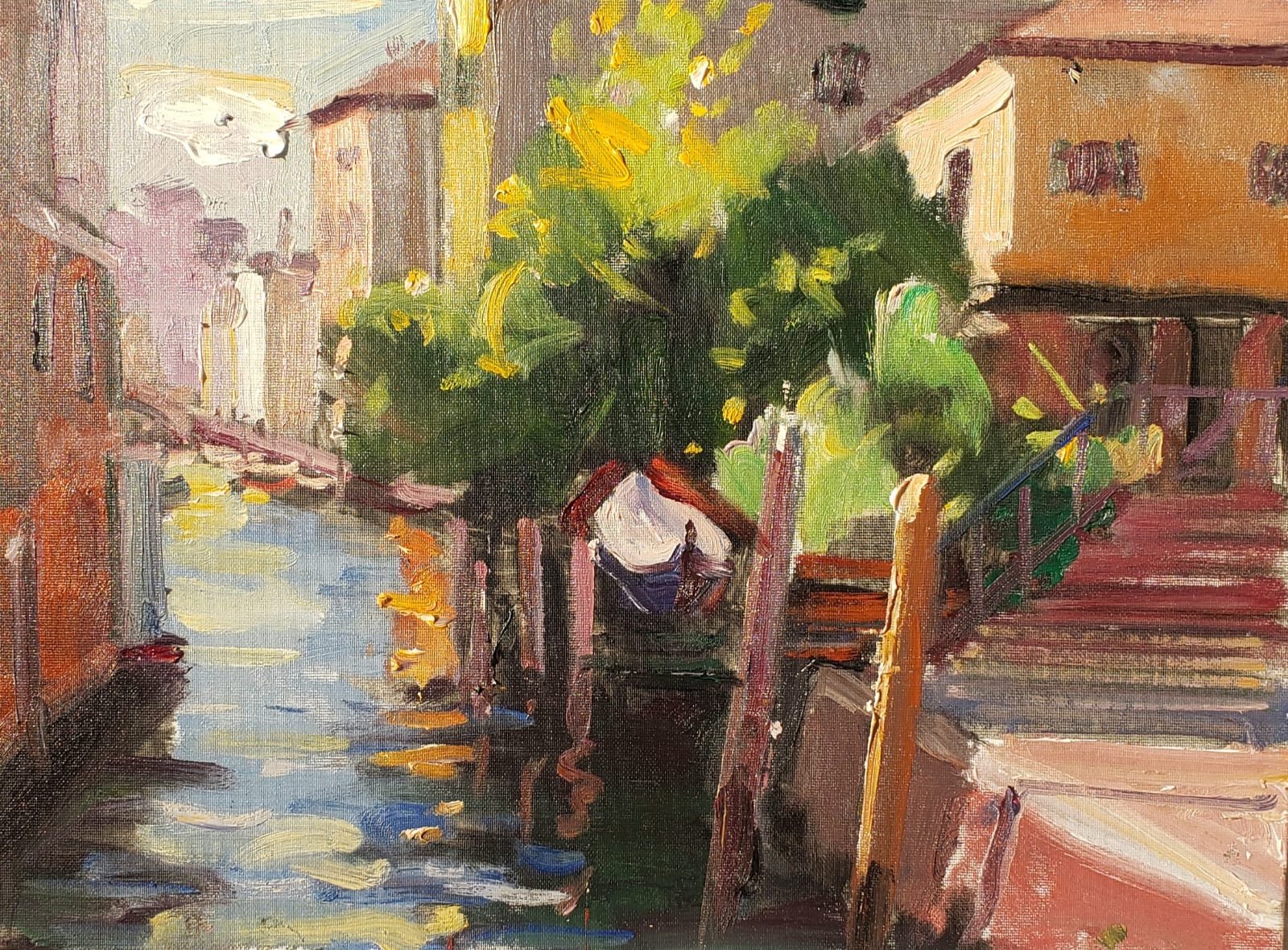
      SQUERO A CANNAREGIO
  • Collecting art in Scottsdale: A practical guide for collectors

    Collecting art in Scottsdale: A practical guide for collectors

    Late afternoon in Scottsdale can flatten a room into gold and shadow at once: a linen sofa pulled a little too far from the wall, a pale plaster surface waiting for the right scale, a canvas leaning beside a doorway so you can see how its edge catches the light. In that kind of room, an artwork stops being an abstract idea and becomes a physical decision. The height of the ceiling, the texture of the wall, the distance from the nearest window, even the finish on the frame all change how the piece reads.

    This guide treats collecting as a judgment problem, not a decoration problem. Before a work belongs on your wall, you want to know what can be verified: provenance, condition, medium, support, dimensions, framing, authenticity, and whether the scale actually fits the room you have in mind. A strong purchase is usually the one where the facts line up cleanly—what the surface shows, what the paperwork supports, what the artist’s method implies, and what the piece will ask of the space once it is installed. For readers comparing options against the market here, the point is not to buy quickly; it is to buy with enough clarity to ask the next right question.

    If you want the local context that shaped this approach, the earlier notes are a useful companion before you move into the details below.

    Table of Contents

    Evidence and paper trail: what to verify first

    The first thing to ask for is not a sales pitch but the paper trail: invoice, exhibition history, prior ownership, and any conservation or framing records that travel with the work. A credible offer should let you answer a simple question without guesswork: who owned it, when did it change hands, and what documentation supports that path? If the seller can only speak in generalities, the story is thinner than the asking price suggests.

    That thinness changes the decision immediately. A work with strong visual appeal but no provenance may still be worth considering, but only at a level that reflects the risk and the work required to verify it. Ask for dated images, gallery labels, condition notes, and, where relevant, a chain of custody that can be checked against exhibition records or a catalogue entry. For historical work, a quick comparison with a source like the Getty Proven. resources can reveal whether the paper trail is complete or merely decorative.

    For a living artist, the documentation should be even cleaner: title, date, medium, support, dimensions, and a signed certificate or invoice that matches the object in front of you. If the dimensions on paper do not match what you measure on the wall, or if the medium is described loosely when the surface tells a different story, pause. Those are not minor clerical errors; they are signals that the offer has not been prepared with enough care.

    At this stage, the useful comparison is between evidence and price. A work with a clear record, stable ownership, and consistent description can support a stronger number; one with gaps should not be treated as if the gaps were invisible. That is the point at which the conversation becomes concrete again, and the next filter is whether the condition and medium can carry the value being claimed.

    Condition, medium, and conservation implications

    Once the record is credible, the surface has to earn its keep. In Scottsdale light, where strong sun and bright interiors can make flaws louder, a buyer should ask to see the work under even illumination and from an angle: are there cracks, cupping, lifting paint, foxing, stretcher marks, or a softened varnish that hides earlier restoration? If the answer comes with paperwork, fine, but the object itself should still tell the same story. A clean condition report matters most when it is specific: location of damage, size of losses, prior inpainting, and whether any treatment was reversible.

    Medium changes the risk profile. Oil on linen, oil on panel, watercolor, mixed media, and works on paper age differently, and the support is as important as the image. A collector comparing two pieces should ask, “What is the support, what are the dimensions to the nearest quarter inch, and has it been relined, mounted, or reframed?” That is not a technicality; it affects how the work behaves in heat, humidity, and transport. For buyers looking through the shop, that question also helps compare scale and material honestly, instead of assuming two similar images will live in a room the same way.

    Ask for the exact conservation history in plain language: what was done, when, by whom, and whether any intervention changed the original surface. If a seller says the work has “been restored,” ask for the conservator’s invoice or report and a close image of the affected area. A small stable repair is one thing; an overcleaned varnish or aggressive retouching is another, especially when the price claims rarity or importance. When the work is by a living artist, a note from the studio about materials and intended display conditions can be useful, and Tony Green’s background makes that kind of method conversation especially relevant to collectors weighing longevity as well as appearance.

    The practical test is simple: can the piece live where you want to place it without constant compromise? Before paying, compare the work’s medium, scale, and frame depth against the wall, glazing, and light available in the room.

    Scale, placement, and how the work lives in the room

    The real test begins where the wall meets the furniture. A work that looks elegant in a gallery can feel cramped above a sofa, float awkwardly over a console, or disappear in a long corridor. Measure the wall span, the furniture width below it, and the clear height from floor to hanging point before you commit. In Scottsdale homes, where strong light and open plans can make edges read harder, those numbers matter as much as the image itself.

    Ask for the framed dimensions, not just the image size, and compare the frame depth to the room’s sightlines. A shallow frame may sit cleanly in a narrow passage; a deeper one can project beautifully in a larger room, but only if it does not crowd door swings or catch glare from nearby windows. If the work will hang near a window or opposite a glass door, confirm whether the surface is matte, varnished, or glazed, because that finish will decide how the piece reads at different hours.

    Lighting is part of the purchase, not an afterthought. A painting under warm lamplight can feel intimate at night and flat in morning sun; a work with reflective glazing may lose its clarity entirely if it faces direct desert light. Before buying, ask for a photo of the piece in the kind of setting you intend to use, or place painter’s tape on the wall to mark the exact footprint. If the scale is close but not exact, a commission can solve the fit without forcing the room to adapt around the object.

    When the dimensions are right, the room stops arguing with the work and starts supporting it. That is the point where a collector can move from comparing size and placement to considering whether the title, subject, and maker’s intent still align with the object in front of them; Tony Green’s background and available work make that conversation easier to have with specifics rather than guesswork.

    A 90-second checklist before you buy

    One fast comparison can save you from a costly mismatch: place the candidate beside a known reference in your mind, such as the scale of an overmantel, a stair landing, or the clear wall at eye level in a room you use daily. If you are standing in front of a work after a visit to O’Keeffe Mus. or after a stop at the FREE Admission at Western Spirit Celebrating Their $12 Million Expansion! listing, the better question is not whether you like the object, but whether you can name where it will live, what will support it, and whether the frame helps or fights the image. FREE Admission at Western Spirit Celebrating Their $12 gives you a public counterpoint here: it shows how much presentation can shape first impressions before the work has to stand on its own.

    Before money changes hands, ask for the document set that lets the story and the object agree: invoice, provenance note, condition note, and a current image of the reverse. If the room is still uncertain, a commission conversation can solve the fit more cleanly than forcing a near miss; that is where Commission becomes useful, especially when the wall, the light, and the intended viewing distance all need to be coordinated.

    Authenticity, comparison, and when the story outruns the object

    Once the paperwork is in hand, the sharper test is whether the object can hold the same story without help. A work may come with a polished narrative, but if the signature style shifts under close viewing, the support feels wrong for the stated period, or the surface has been altered too aggressively, the claim weakens fast. In Scottsdale, where buyers often compare across galleries, private sales, and advisory channels, ask for one clean comparison point: a documented example by the same artist, same medium, and similar date. If the seller cannot show how this piece aligns with that reference, the story is doing more work than the object.

    The sales story outruns the object when the language gets larger than the facts. “Museum quality” is easy to say; it means little unless the dimensions, condition, and provenance support the claim. A useful question is whether the same work would still make sense if the label were removed and only the image, support, and measurements remained. If the answer is yes, the piece is probably carrying its own weight. If the answer depends on a dramatic backstory, compare it with other available work in the shop or, for a room-specific fit, a focused commission conversation; that is usually where the next decision becomes clear.

    How to use Scottsdale as context without outsourcing your judgment

    Scottsdale can sharpen a buyer’s eye without becoming the authority. In a market where polished presentation is common, the useful question is not whether a piece looks expensive in a bright gallery, but whether it still holds together when you picture it in the room you actually have. That means comparing the work against your wall height, sightlines, and the amount of visual activity already in the space, rather than letting the local gallery atmosphere do the persuading for you.

    When the room calls for something specific, custom is often the more honest route than forcing a near-fit into place. A commission conversation can settle scale, palette, and placement before the work is made, which is often the better answer for collectors who already know the wall but not yet the object. The practical test is simple: if the piece still makes sense after the sales language falls away, and you can explain why it belongs where you plan to live with it, you are ready for the next comparison.

    collecting art in Scottsdale – Scottsdale
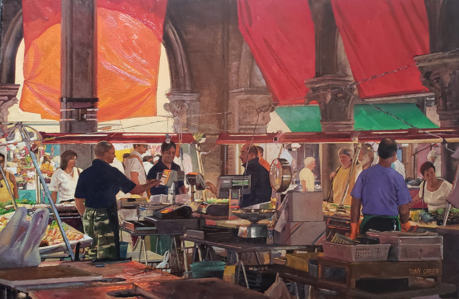
    RIALTO FISH MARKET